Archive
Is this fitted line believable? A visual answer
The only information contained in the statement that a straight line has been fitted to the data, is that the data contains two or more points; modern tools will find a fit to anything that is thrown at them, without raising a sweat; a quadratic equation requires three or more points and so on.
How believable is an equation that has been fitted to data?
There are various technical ways of answering this question, but as a first pass I prefer a simple visual approach. How believable do the lines in the plots below appear to you (code+data)?
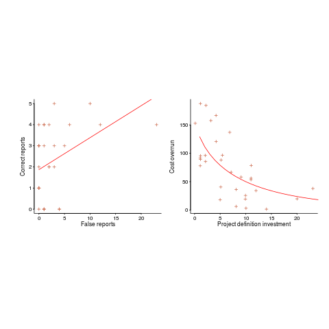
Now I could fire p-values at you, or show you various regression diagnostic plots. Would you be any the wiser? If you were it’s because you know some technical details and switched your brain on to use them. People hate having to switch their brain’s on; a technique that works with the brain switched off is much more practical.
Adding confidence intervals to a plot is one technique (below left uses the default 95% interval) and another is to draw the line of a LOESS fit (below right uses R’s loess function):
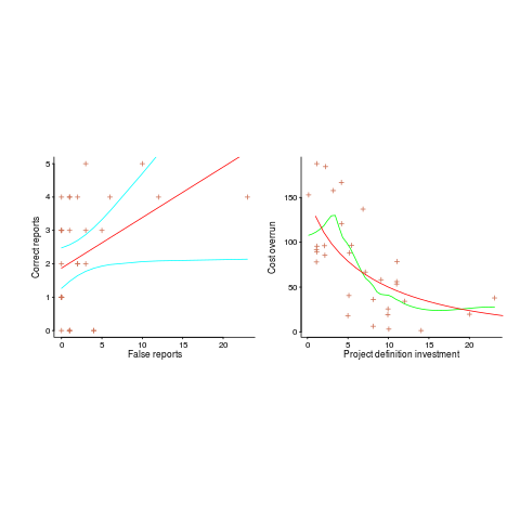
The confidence intervals (in blue) are showing us that there is huge uncertainty in the fitted equation; no technical details needed.
The Local in LOESS means that some local set of points are used to fit each part of the line. That green line is telling us that the mean value of the data does not continue to increase, but levels off (the data is from a NASA presentation that showed an ever-increasing fitted line; which is the view the speaker wanted people to believe).
If somebody shows you a line that has been fitted to the data, ask to see the confidence intervals and the loess from a fit. The willingness of the person to show you these, or their ability to do so, will tell you a lot.
R’s plot function, the 1970’s retro look is not cool any more
Casual users of a system want to learn a few simple rules that enable them to get most things done. Many languages have a design principle of only providing one way of doing things. Members of one language family are known for providing umpteen different ways of doing something and R is no exception.
R comes with the plot function as part of the base system. I am an admirer of plot‘s ability to take whatever is thrown at it and generally produce a workman-like graphical image; workman-like is a kinder description than 1970’s retro look.
R has a thriving library of add-on packages and the package ggplot2 is a byword for fancy graphics in the R community. Anybody reading the description of the qplot function, in this package, would think it is the death kneel for plot. They would be wrong, qplot contains a fatal flaw, it does a very poor job of handling the simple stuff (often generating weird error messages in the process).
In the beginning I’m sure Hadley Wickham, the design+implementor of ggplot/ggplot2, was more concerned with getting his ideas implemented and was not looking to produce a replacement for plot. Unfortunately it looks as-if the vision for functions in the ggplot package is as high-end plot replacements (i.e., for power users) and not as universal plot replacements (i.e., support for casual users).
This leaves me pulling my hair out trying to produce beautiful looking graphs for a book I am working on. The readership are likely to be casual users of R and I am trying to recommend one way of doing something for every task. The source code+data of all the examples will be freely available and I’m eating my own dog food, so its plot I have to use.
Automatically generating railroad diagrams from yacc files
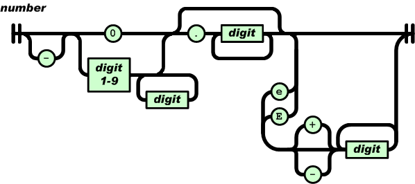
Reading and understanding a language’s syntax written in the BNF-like notation used by yacc/bison takes some practice. Railroad diagrams are a much more user friendly notation, but require a lot of manual tweaking before they look as good as the following example from the json.org website:
I’m currently working on a language whose syntax is evolving and I want to create a visual representation of it that can be read by non-yacc experts; spending a day of so manually creating a decent looking railroad diagram is not an efficient use of time. What automatic visualization tools are out there that I can use?
A couple of tools that look like they might produce useful results are web based (e.g., bottlecaps.de; working on an internal project for a company means I cannot take this approach). Some tools take EBNF as input (e.g., my28msec.com which is also online based); the Extensions in EBNF obviate the need for many of the low level organizational details that appear in grammars written with BNF, making grammars written using EBNF easier to layout and look good; great if I was working with EBNF. The yacc file input tools I tried (yaccviso, Vyacc) were a bit too fragile and the output was not that good.
Bison has an option to generate a output that can be processed into graphical form (using graphviz as the layout engine). Unfortunately the graphs produced are as visually tangled as the input grammar and if anything harder to follow.
It is possible to produce great looking visual diagrams using a simple tool if you are willing to spend lots of fiddling with the input grammar to control the output. I wanted to take the grammar as written (i.e., a yacc input file) and am willing to accept less than perfect output.
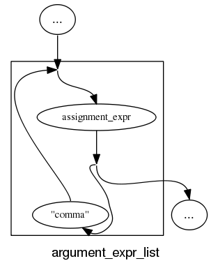
Most of the syntax rules in a yacc grammar are straight forward sequences of tokens that have an obvious one-to-one mapping and there are a few commonly seen idioms. I decided to write a tool that concentrated on untangling the idioms and let the simple stuff look after itself. One idiom that has a visual representation very different from its yacc form is the two productions used to specify an arbitrary long list, e.g., a semicolon separated list of ys is often written as (ok, there might perhaps be times when right recursion is appropriate):
x : y | x ";" y ; |
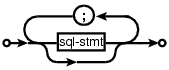
and I wanted something that looked like (from the sql-lite web site, which goes one better and allows support for the list to be optional:
Graph layout is a complicated business and like everybody else I decided to use graphviz to do the heavy lifting (specifically I would generate the layout directives used by dot). All I had to do was write a yacc grammar to dot translator (and not spend lots of time doing it).
The dot language provides a directives that specify the visual properties of nodes and the connections between them. For instance:
n_0[shape=point] n_1[label="sql-stmt"] n_2[label=";"] n_3[shape=point] n_0 -> n_3 n_0 -> n_1 n_1 -> n_3 n_1 -> n_2 n_2 -> n_1 |
is the dot specification of the optional semicolon separated list of sql-stmts displayed above.
Dot takes a list of directives describing the nodes and edges of a graph and makes its own decisions about how to layout the output. It is possible to specify in excruciating detail exactly how to do the layout, but I wanted everything to be automated.
I decided to write the tool in awk because it has great input token handling facilities and I use it often enough to be fluent.
Each grammar rule containing one or more productions is mapped to a single graph. When generating postscript dot puts each graph on a separate page, other output formats appear to loose all but one of the graphs. To make sure each rule fitted on a page I had the text point size depend on the number of productions in a rule, more productions smaller point size. The most common idioms are handled (i.e., list-of and optional construct) with hooks available to handle others. Productions within a rule will often have common token sequences but the current version only checks for matching token sequences at the start of a production and all productions in a rule have to start with the same sequence. Words written all in upper-case are assumed to be language tokens and are converted to lower case and bracketed with quotes. The 300+ lines of conversion tool’s awk source is available for download.
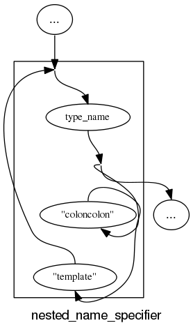
The follow examples are taken from an attempted yacc grammar of C++ done when people still thought such a thing could be created. While the output does have a certain railroad diagram feel to it, the terrain must be very hilly to generate those curvaceous lines.
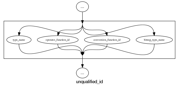
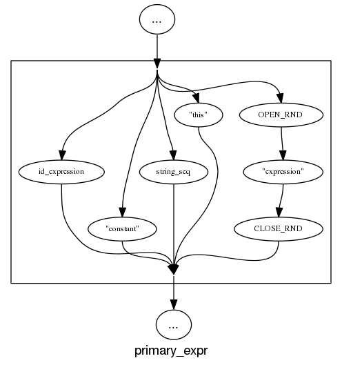
and the run of the mill rules look good, a C++ primary-expression is:
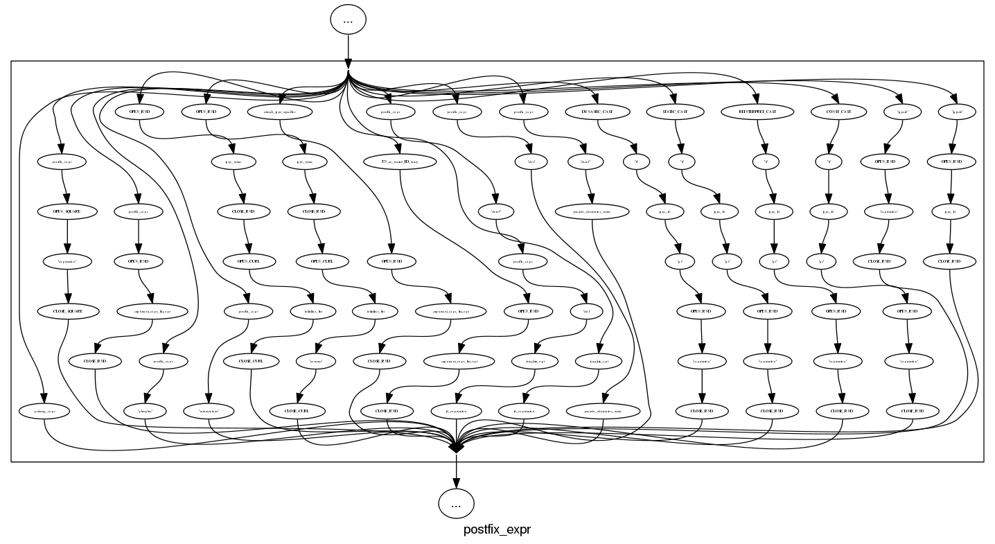
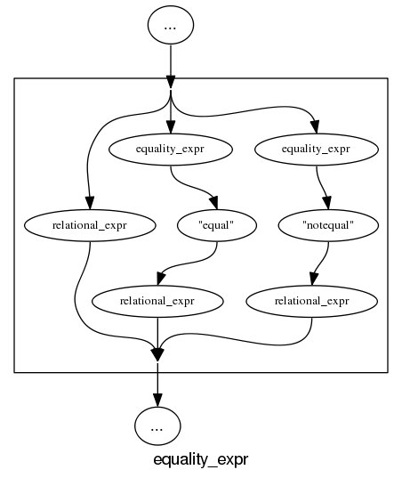
and we can rely on C++ to push syntax rule complexity to the limit, a postfix-expression is:
What about the idioms? A simple list of items looks good:
and slightly less good when separators are involved:
and if we push our luck things start to look tangled:
With a bit more work invested on merging token sequences common to two or more rules the following might look a lot less cluttered:
Apart from a few tangled cases the results are not bad for a tool that was a few hours work. I will wait a bit to see if the people I deal with find this visual form of use.
In the meantime I would be interested to hear about my readers experience with visualizing grammars, using dot to this kind of thing and any suggestions they have. As a long time user of dot I know that there are lots of ways of influencing the final layout (e.g., changing the ordering or edges and nodes in its input), I will have to be careful not to get pulled down this rabbit hole.
Readability: we know nothing
Readability is one of those terms that developers use and expect other developers to understand while at the same time being unable to define what it is or how it might be measured. I think all developers would agree that their own code is very readable; if only different developers stopped writing code in different ways the issue would go away 🙂
Having written a book containing lots of material on cognitive psychology and how it might apply to programming, developers who have advanced beyond “Write code like me and it will be readable” sometimes ask for my perceived expert view on the subject. Unfortunately my expertise has only advanced to the stage of: 1) having a good idea of what research questions need to be addressed, 2) being able to point at experimental results showing that most claimed good readability tips are at best worthless or may even increase cognitive load during reading.
To a good approximation we know nothing about code readability. What questions need to answered to change this situation?
The first and most important readability question is: what is the purpose of looking at the code? Is the code being read to gain understanding (likely to involve ‘slow’ and deliberate behavior) or is the reader searching for some construct (likely to involve skimming; yes, slow and deliberate is more accurate but people make cost/benefit decisions when deciding which strategies to use. The factors involved in reader strategy selection is another important question)?
Next we need to ask what characteristics of developer performance are expected to change with different code organization/layouts. Are we interested in minimizing error, minimizing the time taken to achieve the readers purpose or something else?
What source code attributes play a significant role in readability? Possibilities include the order in which various constructs appear (e.g., should variable definitions appear at the start of a function or close to where they are first used), variable names and the position of tokens relative to each other when viewed by the reader.
Questions involving the relative position of tokens probably generates the greatest volume of discussion among developers. To what extent does visual organization of source code affect reader performance? Fluent reading requires a significant amount of practice, perhaps readable code is whatever developers have spent lots of time reading.
If there is some characteristic of the human visual system that generates a worthwhile benefit to splitting long lines so that a binary operator appears at the {end of the last}/{start of the next} line, will it apply the same way to all developers? We could end up developers having to configure their editor so it displays code in a form that matches the characteristics of their visual system.
How might these ‘visual’ questions be answered? I think that eye tracking will play a large role (“Eyetracking Web Usability” by Jakob Nielsen and Kara Pernice is a good read). At the moment there are technical/usability issues that make this kind of research very difficult. Eye trackers capable of continuously supporting enough resolution to know which character on the screen a developer is looking at (e.g., EyeLink 1000) require that the head be held in a fixed position, while those allowing completely free head movement (e.g., S2 Eye Tracker) don’t yet continuously support the required resolution.
Of course any theory derived from eye tracking experiments will still have to be validated by measuring developer performance on various code snippets.
Christmas book for 2010
I’m rather late with my list of Christmas books for 2010. While I do have a huge stack of books waiting to be read I don’t seem to have read many books this year (I have been reading lots of rather technical blogs this year, i.e., time/thought consuming ones) and there is only one book I would strongly recommend.
Anybody with even the slightest of interest in code readability needs to read
Reading in the Brain by Stanislaw Dehaene (the guy who wrote The Number Sense, another highly recommended book). The style of the book is half way between being populist and being an undergraduate text.
Most of the discussion centers around the hardware/software processing that takes place in what Dehaene refers to as the letterbox area of the brain (in the left occipito-temporal cortex). The hardware being neurons in the human brain and software being the connections between them (part genetically hardwired and part selectively learned as the brain’s owner goes through childhood; Dehaene is not a software developer and does not use this hardware/software metaphor).
As any engineer knows, knowledge of the functional characteristics of a system are essential when designing other systems to work with it. Reading this book will help people separate out the plausible from the functionally implausible in discussions about code readability.
Time and again the reading process has co-opted brain functionality that appears to have been designed to perform other activities. During the evolution of writing there also seems to have been some adaptation to existing processes in the brain; a lesson here for people designing code visualizations tools.
In my C book I tried to provide an overview of the reading process but skipped discussing what went on in the brain, partly through ignorance on my part and also a belief that we were a long way from having an accurate model. Dehaene’s book clearly shows that a good model of what goes on in the brain during reading is now available.
Recent Comments