Archive
The lifetime of performance coding issues
Coding activities that a developer might spend time on include: adding new functionality, fixing a reported fault, or fiddling with existing code with the intent of making it ‘better’ in some sense (which these days goes by the catch-all name of refactoring).
Improving performance, e.g., changing software to use less cpu/memory is considered, by developers, to make it ‘better’ (whether users are likely to notice the difference, or management see a ROI is for another article). There is a breed of developer whose DNA encodes for pleasure receptors that are only fire when working to reduce the amount of cpu/memory used by a program.
The paper Characterizing the evolution of statically-detectable performance issues of Android Apps by Das, Di Penta, and Malavolta studied the creation/removal of nine distinct performance coding issues in the source of 316 Android Apps (118 Apps contained five or more issues); a total of 2,408 performance issues were tracked.
What patterns might be present in the paper’s performance issues data?
I would expect there to be more creations in Apps containing more code, and more removals the longer an App is maintained; both very obvious. With more developers working on an App, there are going to be more creations and removals; do they cancel out? Management might decide to invest time in performance improvements for the next release, which would cause a spike in the number of removals per unit time.
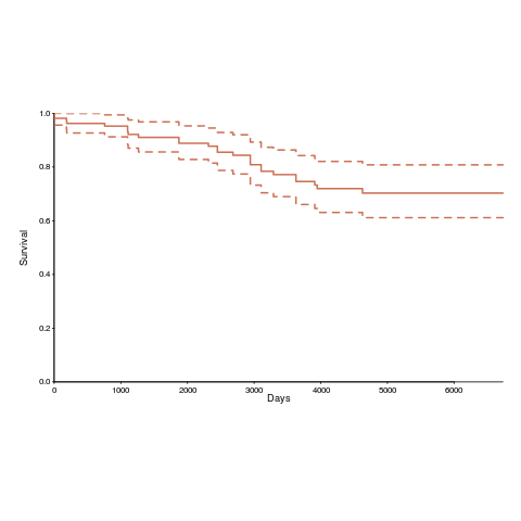
How long do the nine performance issues survive in code, before being removed? The plot below shows the Kaplan Meier survival curve for Apps containing at least five issues (dotted blue/green are the 95% confidence intervals, code+data):
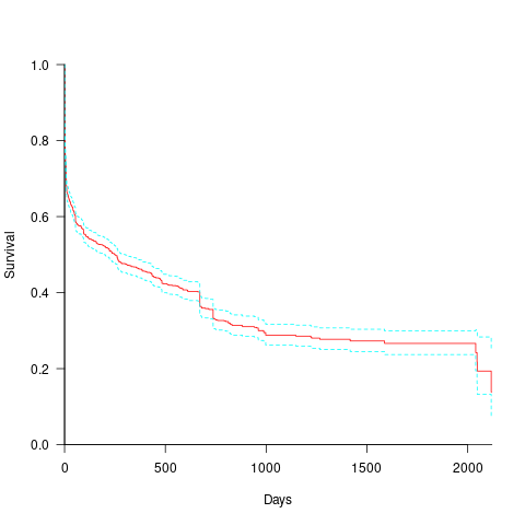
Around 15% of issues were removed on the day they are created, and by the eighth day around 30% had been removed. The roughly steady decline lasts for two-years, followed by almost stasis. Is two-years the active development lifetime of a successful Android App?
In isolation, the slope of the survival curve between eight days and two-years is not that interesting (it could be used to rule out models of the issue discovery process, e.g., happenstance discovery while working on other tasks). However, comparing it against the corresponding survival curve for reported faults tells us something about developer/management investment priorities for the two kinds of tasks, as measured by time to fix (which is a proxy for effort invested).
Unfortunately, this study did not collect information on coding mistake lifetimes, or time between a fault being reported and fixed. There have been studies investigating the survival time of coding mistakes. Reported faults should have the lowest survival rate, while the survival of coding mistakes will depend on the number of users (i.e., more users creates more opportunities to experience a fault and report it).
What factors influence performance issue time-to-fix?
The data includes information on the kind of performance issue, the number of times the App has been downloaded from the Google Play Store, and the number of contributors to the App.
Using these variables, a Cox proportional hazards model was fitted to model the survival time. In a proportional hazards model, the model coefficients are not absolute values, but provide ratio information. For instance, the following table shows the coefficients of the fitted model (code+data). Using these coefficients, we can compare the time taken to fix, say, a FloatMath issue relative to a ViewTag issue. The coefficient ratio  is the estimated ratio of fix times of the two respective issues.
Coefficient Standard error Performance issue FloatMath 0.64445 0.14175 HandlerLeak 0.69958 0.12736 Recycle 0.83041 0.11386 UseSparseArrays 0.73471 0.12493 UseValueOf 0.64263 0.11827 ViewHolder 0.87253 0.14951 ViewTag 5.24257 0.46500 Wakelock 3.34665 0.72014 Downloads 50-100 0.62490 0.26245 100-500 0.64699 0.22494 500-1000 0.56768 0.23505 1000-5000 0.50707 0.22225 5000-10000 0.53432 0.22486 10000-50000 0.62449 0.21626 50000-100000 0.42214 0.23402 100000-500000 0.21479 0.25358 1000000-5000000 0.40593 0.21851 10000000-50000000 0.03474 0.61827 100000000-500000000 0.30693 0.39868 1000000000-5000000000 0.41522 0.61599 NA 0.03868 1.02076 Contributors 1.04996 0.01265 |
There is not a lot of difference in the coefficients for the number of downloads (the model fit is poor when the Standard error is close to the Coefficient value).
The paper Investigating Types and Survivability of Performance Bugs in Mobile Apps analyses a smaller dataset of performance issue lifetimes.
Studying the lifetime of Open source
A software system can be said to be dead when the information needed to run it ceases to be available.
Provided the necessary information is available, plus time/money, no software ever has to remain dead, hardware emulators can be created, support libraries can be created, and other necessary files cobbled together.
In the case of software as a service, the vendor may simply stop supplying the service; after which, in my experience, critical components of the internal service ecosystem soon disperse and are forgotten about.
Users like the software they use to be actively maintained (i.e., there are one or more developers currently working on the code). This preference is culturally driven, in that we are living through a period in which most in-use software systems are actively maintained.
Active maintenance is perceived as a signal that the software has some amount of popularity (i.e., used by other people), and is up-to-date (whatever that means, but might include supporting the latest features, or problem reports are being processed; neither of which need be true). Commercial users like actively maintained software because it enables the option of paying for any modifications they need to be made.
Software can be a zombie, i.e., neither dead or alive. Zombie software will continue to work for as long as the behavior of its external dependencies (e.g., libraries) remains sufficiently the same.
Active maintenance requires time/money. If active maintenance is required, then invest the time/money.
Open source software has become widely used. Is Open source software frequently maintained, or do projects inhabit some form of zombie state?
Researchers have investigated various aspects of the life cycle of open source projects, including: maintenance activity, pull acceptance/merging or abandoned, and turnover of core developers; also, projects in niche ecosystems have been investigated.
The commits/pull requests/issues, of circa 1K project repos with lots of stars, is data that can be automatically extracted and analysed in bulk. What is missing from the analysis is the context around the creation, development and apparent abandonment of these projects.
Application areas and development tools (e.g., editor, database, gui framework, communications, scientific, engineering) tend to have a few widely used programs, which continue to be actively worked on. Some people enjoy creating programs/apps, and will start development in an area where there are existing widely used programs, purely for the enjoyment or to scratch an itch; rarely with the intent of long term maintenance, even when their project attracts many other developers.
I suspect that much of the existing research is simply measuring the background fizz of look-alike programs coming and going.
A more realistic model of the lifecycle of Open source projects requires human information; the intent of the core developers, e.g., whether the project is intended to be long-term, primarily supported by commercial interests, abandoned for a successor project, or whether events got in the way of the great things planned.
Multi-state survival modeling of a Jira issues snapshot
Work items in a formal development process progress through a series of stages, e.g., starting at Open, perhaps moving to Withdrawn or Merged with another item, eventually reaching Development, and finishing at Done (with a few being Reopened, i.e., moving back to the start of the process).
This process can be modelled as a Markov chain, provided data on each stage of the process is available, for each work item; allowing values such as average time spent in each state and transition probabilities to be calculated.
The Jira issue/task/bug/etc tracking system has an option to generate a snapshot of the current status of work items in the system. The snapshot information on each item includes: start-date, current-state, time-in-state, date-of-snapshot.
If we assume that all work items pass through the same sequence of states, from Open to Done, then the snapshot contains enough information to build a multi-state survival model.
The key information is time-in-state, which can be used to calculate the date/time when an item transitioned from its previous state to its current state, providing a required link between all states.
How is a multi-state survival model better than creating a distinct survival model for each state?
The calculation of each state in a multi-state model takes into account information from the succeeding state, i.e., the time-in-state value in the succeeding state provides timing (from the Start state) on when a work item transitioned from its previous state. While this information could be added to each of the distinct models, it’s simpler to bundle everything together in one model.
A data analysis article by Robert Krasinski linked to the data used 🙂 The data does not include a description of the columns, but most of the names appear self-explanatory (I have no idea what key might be). Each of the 3,761 rows includes a story-point estimate, team-id, and a tag name for the work item.
Building a multi-state model provides a means for estimating the impact of team-id and story-points on time-in-state. I would expect items with higher story-point estimates to spend longer in Development, but I’m not sure how much difference there will be on other states.
I pruned the 22 states present in the data down to the following sequence of 13. Items might be Withdrawn or Merged with others items at any time, but I’m keeping things simple. These two states should also be absorbing in that there is no exit from them, I faked this by adding a transition to Done.
           Open
           Withdrawn
           Merged
           Backlog
           In Analysis
           In Refinement
           Ready for Development
           In Development
           Code Review
           Ready for Test
           In Testing
           Ready for Signoff
Done |
I’m familiar with building survival models, but have only ever built a couple of multi-state survival models. R supports several packages, which is the best one to use for this minimalist multi-state dataset?
The msm package is very much into state transition probabilities, or at least that is the impression I got from reading its manual. flexsurv and mstate are other packages I looked at. I decided to stay with the survival package, the default for simpler problems; the manuals contained lots of examples and some of them appeared similar to my problem.
Each row of work item information in the Jira snapshot looks something like the following:
X daysInStatus start status obsdate 1 0.53 2020-05-12 In Development 2020-05-18 |
This work item transitioned from state Ready for Development at time  to state In Development at time
  , and was still in state In Development at time
  (when the snapshot was taken); the
  is a small interval used to separate the states.
As is often the case with R packages, most of the work went into figuring out how to call the library functions with the data formatted just so, plus of course my own misunderstandings. Once the data was cleaned and process, the analysis was one line of code plus one to print the results; for instance, to estimate the mean time in each state by story-point value (code+data):
sp_fit=survfit(Surv(tstop-tstart, state) ~ sp, data=merged_status) print(sp_fit) |
Given the uncertainties in this model building process, I’m not going to discuss the results. This post is a proof of concept, which others can apply when the sequence of states is known with some degree of confidence, and good reasons for noise in the data are available.
Survival rate of WG21 meeting attendance
WG21, the C++ Standards committee, has a very active membership, with lots of people attending the regular meetings; there are three or four meetings a year, with an average meeting attendance of 67 (between 2004 and 2016).
The minutes of WG21 meetings list those who attend, and a while ago I downloaded these for meetings between 2004 and 2016. Last night I scraped the data and cleaned it up (or at least the attendee names).
WG21 had its first meeting in 1992, and continues to have meetings (eleven physical meetings at the time or writing). This means the data is both left and right censored; known as interval censored. Some people will have attended many meetings before the scraped data starts, and some people listed in the data may not have attended another meeting since.
What can we say about the survival rate of a person being a WG21 attendee in the future, e.g., what is the probability they will attend another meeting?
Most regular attendees are likely to miss a meeting every now and again (six people attended all 30 meetings in the dataset, with 22 attending more than 25), and I assumed that anybody who attended a meeting after 1 January 2015 was still attending. Various techniques are available to estimate the likelihood that known attendees were attending meetings prior to those in the dataset (I’m going with what ever R’s survival package does). The default behavior of R’s Surv function is to handle right censoring, the common case. Extra arguments are needed to handle interval censored data, and I think I got these right (I had to cast a logical argument to numeric for some reason; see code+data).
The survival curves in days since 1 Jan 2004, and meetings based on the first meeting in 2004, with 95% confidence bounds, look like this:
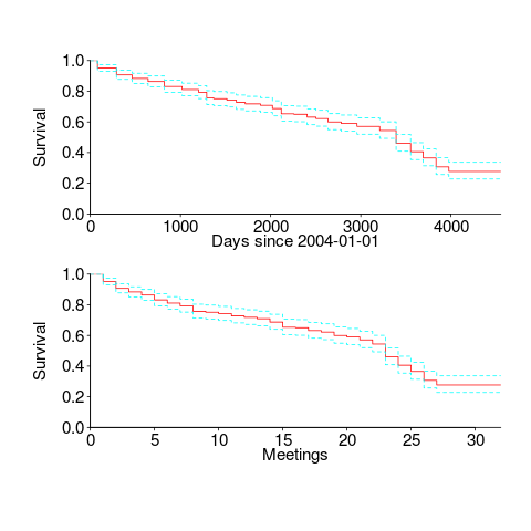
I was expecting a sharper initial reduction, and perhaps wider confidence bounds. Of the 374 people listed as attending a meeting, 177 (47%) only appear once and 36 (10%) appear twice; there is a long tail, with 1.6% appearing at every meeting. But what do I know, my experience of interval censored data is rather limited.
The half-life of attendance is 9 to 10 years, suspiciously close to the interval of the data. Perhaps a reader will scrape the minutes from earlier meetings 🙂
Within the time interval of the data, new revisions of the C++ standard occurred in 20072011 and 2014; there had also been a new release in 2003, and one was being worked on for 2017. I know some people stop attending meetings after a major milestone, such as a new standard being published. A fancier analysis would investigate the impact of standards being published on meeting attendance.
People also change jobs. Do WG21 attendees change jobs to ones that also require/allow them to attend WG21 meetings? The attendee’s company is often listed in the minutes (and is in the data). Something for intrepid readers to investigate.
Growth and survival of gcc options and processor support
Like any actively maintained software, compilers get more complicated over time. Languages are still evolving, and options are added to control the support for features. New code optimizations are added, which don’t always work perfectly, and options are added to enable/disable them. New ways of combining object code and libraries are invented, and new options are added to allow the desired combination to be selected.
The web pages summarizing the options for gcc, for the 96 versions between 2.95.2 and 9.1 have a consistent format; which means they are easily scrapped. The following plot shows the number of options relating to various components of the compiler, for these versions (code+data):
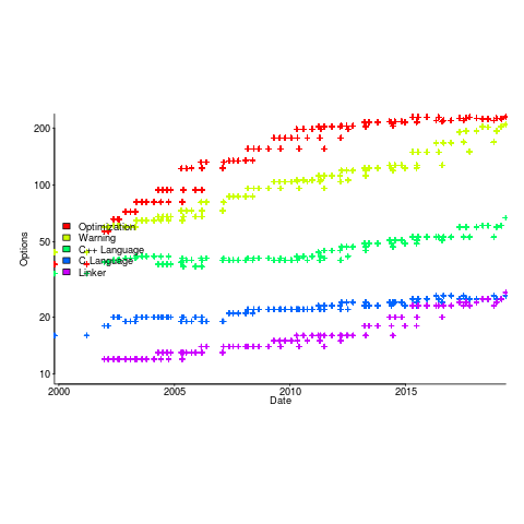
The total number of options grew from 632 to 2,477. The number of new optimizations, or at least the options supporting them, appears to be leveling off, but the number of new warnings continues to increase (ah, the good ol’ days, when -Wall covered everything).
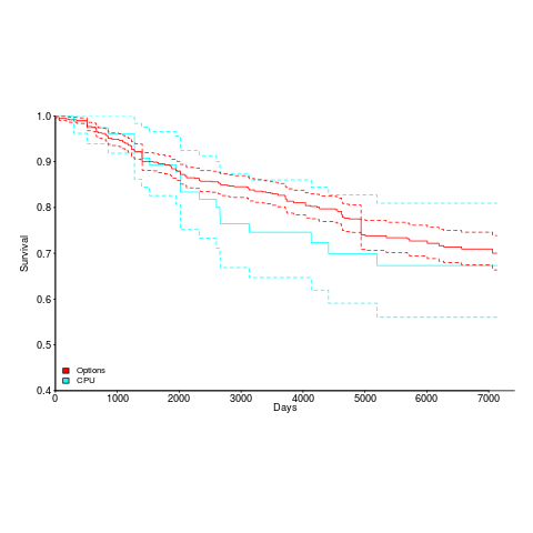
The last phase of a compiler is code generation, and production compilers are generally structured to enable new processors to be supported by plugging in an appropriate code generator; since version 2.95.2, gcc has supported 80 code generators.
What can be added can be removed. The plot below shows the survival curve of gcc support for processors (80 supported cpus, with support for 20 removed up to release 9.1), and non-processor specific options (there have been 1,091 such options, with 214 removed up to release 9.1); the dotted lines are 95% confidence internals.
OSI licenses: number and survival
There is a lot of source code available which is said to be open source. One definition of open source is software that has an associated open source license. Along with promoting open source, the Open Source Initiative (OSI) has a rigorous review process for open source licenses (so they say, I have no expertise in this area), and have become the major licensing brand in this area.
Analyzing the use of licenses in source files and packages has become a niche research topic. The majority of source files don’t contain any license information, and, depending on language, many packages don’t include a license either (see Understanding the Usage, Impact, and Adoption of Non-OSI Approved Licenses). There is some evolution in license usage, i.e., changes of license terms.
I knew that a fair-few open source licenses had been created, but how many, and how long have they been in use?
I don’t know of any other work in this area, and the fastest way to get lots of information on open source licenses was to scrape the brand leader’s licensing page, using the Wayback Machine to obtain historical data. Starting in mid-2007, the OSI licensing page kept to a fixed format, making automatic extraction possible (via an awk script); there were few pages archived for 2000, 2001, and 2002, and no pages available for 2003, 2004, or 2005 (if you have any OSI license lists for these years, please send me a copy).
What do I now know?
Over the years OSI have listed 110107 different open source licenses, and currently lists 81. The actual number of license names listed, since 2000, is 205; the ‘extra’ licenses are the result of naming differences, such as the use of dashes, inclusion of a bracketed acronym (or not), license vs License, etc.
Below is the Kaplan-Meier survival curve (with 95% confidence intervals) of licenses listed on the OSI licensing page (code+data):
How many license proposals have been submitted for review, but not been approved by OSI?
Patrick Masson, from the OSI, kindly replied to my query on number of license submissions. OSI doesn’t maintain a count, and what counts as a submission might be difficult to determine (OSI recently changed the review process to give a definitive rejection; they have also started providing a monthly review status). If any reader is keen, there is an archive of mailing list discussions on license submissions; trawling these would make a good thesis project 🙂
Does public disclosure of vulnerabilities improve vendor response?
Does public disclosure of vulnerabilities in vendor products result in them releasing a fix more quickly, compared to when the vulnerability is only disclosed to the vendor (i.e., no public disclosure)?
A study by Arora, Krishnan, Telang and Yang investigated this question and made their data available 🙂 So what does the data have to say (its from the US National Vulnerability Database over the period 2001-2003)?
The plot below is a survival curve for disclosed vulnerabilities, the longer it takes to release a patch to fix a vulnerability, the longer it survives.
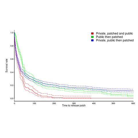
There is a popular belief that public disclosure puts pressure on vendors to release patchs more quickly, compared to when the public knows nothing about the problem. Yet, the survival curve above clearly shows publically disclosed vulnerabilities surviving longer than those only disclosed to the vendor. Is the popular belief wrong?
Digging around the data suggests a possible explanation for this pattern of behavior. Those vulnerabilities having the potential to cause severe nastiness tend not to be made public, but go down the path of private disclosure. Vendors prioritize those vulnerabilities most likely to cause the most trouble, leaving the less troublesome ones for another day.
This idea can be checked by building a regression model (assuming the necessary data is available and it is). In one way or another a lot of the data is censored (e.g., some reported vulnerabilities were not patched when the study finished); the Cox proportional hazards model can handle this (in fact, its the ‘standard’ technique to use for this kind of data).
This is a time dependent problem, some vulnerabilities start off being private and a public disclosure occurs before a patch is released, so there are some complications (see code+data for details). The first half of the output generated by R’s summary function, for the fitted model, is as follows:
Call:
coxph(formula = Surv(patch_days, !is_censored) ~ cluster(ID) +
    priv_di * (log(cvss_score) + y2003 + log(cvss_score):y2002) +
    opensource + y2003 + smallvendor + log(cvss_score):y2002,
    data = ISR_split)

  n= 2242, number of events= 2081

                                  coef exp(coef) se(coef) robust se       z Pr(>|z|)
priv_di                        1.64451   5.17849  0.19398   0.17798   9.240  < 2e-16 ***
log(cvss_score)                0.26966   1.30952  0.06735   0.07286   3.701 0.000215 ***
y2003                          1.03408   2.81253  0.07532   0.07889  13.108  < 2e-16 ***
opensource                     0.21613   1.24127  0.05615   0.05866   3.685 0.000229 ***
smallvendor                   -0.21334   0.80788  0.05449   0.05371  -3.972 7.12e-05 ***
log(cvss_score):y2002          0.31875   1.37541  0.03561   0.03975   8.019 1.11e-15 ***
priv_di:log(cvss_score)       -0.33790   0.71327  0.10545   0.09824  -3.439 0.000583 ***
priv_di:y2003                 -1.38276   0.25089  0.12842   0.11833 -11.686  < 2e-16 ***
priv_di:log(cvss_score):y2002 -0.39845 0.67136 0.05927 0.05272 -7.558 4.09e-14 *** |
The explanatory variable we are interested in is priv_di, which takes the value 1 when the vulnerability is privately disclosed and 0 for public disclosure. The model coefficient for this variable appears at the top of the table and is impressively large (which is consistent with popular belief), but at the bottom of the table there are interactions with other variable and the coefficients are less than 1 (not consistent with popular belief). We are going to have to do some untangling.
cvss_score is a score, assigned by NIST, for the severity of vulnerabilities (larger is more severe).
The following is the component of the fitted equation of interest:
*(0.34+0.4*y2002)-1.4*y2003)}")
where:  is 0/1,
 ") varies between 0.8 and 2.3 (mean value 1.8),
varies between 0.8 and 2.3 (mean value 1.8),  and
and  are 0/1 in their respective years.
Applying hand waving to average away the variables:
)} right e^{{priv~di}(1.6-0.6-(0.7/3+1.4/3))} right e^{{priv~di}*0.3}")
gives a (hand waving mean) percentage increase of *100 right 35%") , when
, when priv_di changes from zero to one. This model is saying that, on average, patches for vulnerabilities that are privately disclosed take 35% longer to appear than when publically disclosed
The percentage change of patch delivery time for vulnerabilities with a low cvvs_score is around 90% and for a high cvvs_score is around 13% (i.e., patch time of vulnerabilities assigned a low priority improves a lot when they are publically disclosed, but patch time for those assigned a high priority is slightly improved).
I have not calculated 95% confidence bounds, they would be a bit over the top for the hand waving in the final part of the analysis. Also the general quality of the model is very poor; Rsquare= 0.148 is reported. A better model may change these percentages.
Has the situation changed in the 15 years since the data used for this analysis? If somebody wants to piece the necessary data together from the National Vulnerability Database, the code is ready to go (ok, some of the model variables may need updating).
Update: Just pushed a model with Rsquare= 0.231, showing a 63% longer patch time for private disclosure.
Survival time of Linux distributions
Creating and maintaining Linux distributions is a surprisingly popular activity. The GNU/Linux Distribution Timeline listed over 500 distributions by the time recording stopped at the end of 2012.
Once a distribution becomes available, how long do the people involved on a distribution continue to maintain it? The plot below shows the survival curve for Linux distributions based on their original parent distribution; the five most popular parent distributions are shown (code+data).
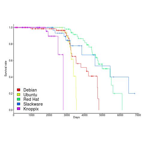
The plus-signs on lines are censored data, that is distributions that are still actively maintained (or at least not listed as no longer supported) when maintenance work on the timeline stopped (October 2012).
My interpretation of the data is that when the maintainers of a parent distribution are responsive to community pressure, it is difficult to motivate people to maintain a distribution derived from it.
RedHat is a commercial distribution and likely to be less focused on the developer community.
Ubuntu (79 derived distributions) and Knoppix (20 derived distributions) are relative newcomers. It looks like Knoppix has been squeezed out by the top 4.
Recent Comments