Archive
Patches for the code of Peter Turchin’s Attrition Warfare Model
The paper Empirically Testing Predictions of an Attrition on Warfare Model for the War in Ukraine, by Peter Turchin, recently showed up during one of my regular searches for software engineering data. A quick scan of the paper founded that it is very empirical, and that the analysis coding was done in R; I could not resist checking out the source code.
One of my first jobs was helping academics fix coding issues with the programs they had written to solve scientific/engineering problems, and this R code reminded me of several habits of scientists who code: the single letter variables used in equations are directly mapped to identifier names, and there is no structure to the code. The code is so short (86 lines) that the lack of structure is a minor inconvenience; a few thousand lines, and it becomes a major headache. The code for Imperial’s COVID model was ten times larger.
Two mistakes in the code/paper jumped out at me, leading to this post. First, some background.
The empirical predictions in the paper are intended to provide insight into who is likely to win the ongoing Ukraine/Russia war. Fighting requires soldiers and these are killed/wounded over time. The country that does not have enough soldiers to at least keep the opposition at bay, looses.
Turchin has proposed what he calls the Attrition War model, based on Lanchester’s laws (various attempts to validate Lanchester’s models, lots of maths to shake a stick at), and the paper solves this model’s set of eight differential equations (each country has the same set of four equations; the connection between the two sets is that one country’s casualty rate and Army size is influenced by the opposing country’s stock of war matériel). The four quantities modelled are casualties, army size, stock of warfare matériel, and production capacity.
Getting predictions out of differential equations requires being able to find a solution to the equations and feeding in numeric values for the various parameters.
Solving the equations is a maths problem, i.e., no knowledge of military matters required. Selecting the equations to solve and the numeric values to feed into the solution is what requires military knowledge. I don’t know anything about military matters; the following analysis is purely related to writing code to solve a set of differential equations, using the equations plus numeric values in Turchin’s November 2023 paper.
For obvious reasons, countries involved in the war do not publish information on the quantities modelled by these equations (which are also likely to be time-dependent). Turchin addresses the changeable nature of the numeric values by introducing various random components into his Attrition model.
From the perspective of solving the eight equations and presenting the results, the following are the two mistakes that jumped out at me (both involving the implementation of the random component):
- When a model contains a random component, there will be a huge/infinite number of possible solutions. The takeaway plots in the paper show a single solution (for each of the four variables/two countries), with the width of the plotted lines and their fluctuating appearance suggesting that they contain multiple solutions. The plot below left shows the solution for artillery shell production over time, as it appears in the paper, while the plot below right shows 100 solutions (each line is a different solution; code):
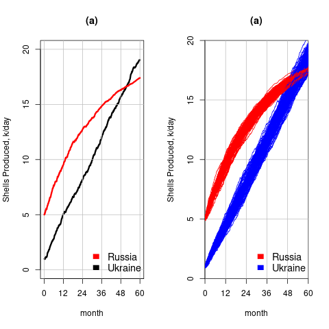
The wedge of lines shows the range of possible solutions (each line drawn overwrites anything previously drawn, and plotting with transparent colors would show the density of solution at a given point; I decided to keep the code simple).
- All the random components are assumed to have a Gaussian distribution. When distribution information is not available, this is usually a safe choice. However, two of the random components must always have non-negative values (i.e., casualties and matériel used can never be negative). The Poisson distribution is the obvious candidate, and a simple search turned up an empirical paper agreeing with this choice (at least for casualties).
The plot below left shows one solution for the number of casualties over time, using the original code, while the plot below right shows 100 solutions using a Poisson distribution for the random component (code):
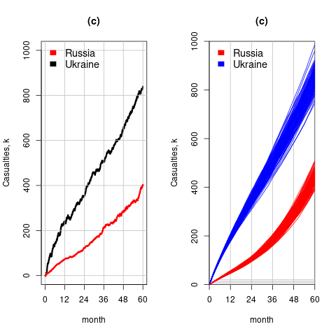
With a Poisson random component, the solutions don’t meander as much, and the variance is smaller than when a Gaussian is used. Technically, it is a more accurate model (if more variance is to be expected a Negative Binomial distribution could be used; see commented out code)
The latest (November) UK government estimate of Russian casualties is 300K, roughly three times larger than predicted by Turchin’s model. Changing the value for the ‘conversion rate of expended matériel to casualties’ from
 to
to  brings the casualty prediction inline with current estimates (we have been hearing a lot about the accuracy of the Ukrainian targetting; see code for details).
I have also reworked the code to add some structure, e.g., separating out solving the equations and setting the initial conditions.
Turchin used the traditional approach to solving differential equations, the one we are taught at school. Before seeing the code, I was half expecting to see a System dynamics approach. The advantage of a systems dynamic approach is flexibility (i.e., easier to add more components) and visualization (i.e., a chart showing what feeds into/out of what); an example. There is an R-based book: System Dynamics Modelling with R.
Extracting numbers from a stacked density plot
A month or so ago, I found a graph showing a percentage of PCs having a given range of memory installed, between March 2000 and April 2020, on a TechTalk page of PC Matic; it had the form of a stacked density plot. This kind of installed memory data is rare, how could I get the underlying values (a previous post covers extracting data from a heatmap)?
The plot below is the image on PC Matic’s site:
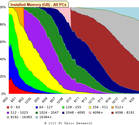
The change of colors creates a distinct boundary between different memory capacity ranges, and it ought to be possible to find the y-axis location of each color change, for a given x-axis location (with location measured in pixels).
The image was a png file, I loaded R’s png package, and a call to readPNG created the required 2-D array of pixel information.
library("png")
img=readPNG("../rc_mem_memrange_all.png") |
Next, the horizontal and vertical pixel boundaries of the colored data needed to be found. The rectangle of data is surrounded by white pixels. The number of white pixels (actually all ones corresponding to the RGB values) along each horizontal and vertical line dramatically drops at the data image boundary. The following code counts the number of col points in each horizontal line (used to find the y-axis bounds):
horizontal_line=function(a_img, col)
{
lines_col=sapply(1:n_lines, function(X) sum((a_img[X, , 1]==col[1]) &
                                            (a_img[X, , 2]==col[2]) &
                                            (a_img[X, , 3]==col[3]))
                )

return(lines_col)
}

white=c(1, 1, 1)
n_cols=dim(img)[2]

# Find where fraction of white points on a line changes dramatically
white_horiz=horizontal_line(img, white)

# handle when upper boundary is missing
ylim=c(0, which(abs(diff(white_horiz/n_cols)) > 0.5))
ylim=ylim[2:3] |
Next, for each vertical column of pixels, at each x-axis pixel location, the sought after y value occurs at the change of color boundary in the corresponding vertical column. This boundary includes a 1-pixel wide separation color, which creates a run of 2 or 3 consecutive pixel color changes.
The color change is easily found using the duplicated function.
# Return y position of vertical color changes at x_pos
y_col_change=function(x_pos)
{
# Good enough technique to generate a unique value per RGB color
col_change=which(!duplicated(img[y_range, x_pos, 1]+
                          10*img[y_range, x_pos, 2]+
                         100*img[y_range, x_pos, 3]))

# Handle a 1-pixel separation line between colors.
# Diff is used to find these consecutive sequences.
y_change=c(1, col_change[which(diff(col_change) > 1)+1])

# Always return a vector containing max_vals elements.
return(c(y_change, rep(NA, max_vals-length(y_change))))
} |
Next, we need to group together the sequence of points that delimit a particular boundary. The points along the same boundary are all associated with the same two colors, i.e., the ones below/above the boundary (plus a possible boundary color).
The plot below shows all the detected boundary points, in black, overwritten by colors denoting the points associated with the same below/above colors (code):

The visible black pluses show that the algorithm is not perfect. The few points here and there can be ignored, but the two blocks at the top of the original image have thrown a spanner in the works for some range of points (this could be fixed manually, or perhaps it is possible to tweak the color extraction formula to work around them).
How well does this approach work with other stacked density plots? No idea, but I am on the lookout for other interesting examples.
Multi-state survival modeling of a Jira issues snapshot
Work items in a formal development process progress through a series of stages, e.g., starting at Open, perhaps moving to Withdrawn or Merged with another item, eventually reaching Development, and finishing at Done (with a few being Reopened, i.e., moving back to the start of the process).
This process can be modelled as a Markov chain, provided data on each stage of the process is available, for each work item; allowing values such as average time spent in each state and transition probabilities to be calculated.
The Jira issue/task/bug/etc tracking system has an option to generate a snapshot of the current status of work items in the system. The snapshot information on each item includes: start-date, current-state, time-in-state, date-of-snapshot.
If we assume that all work items pass through the same sequence of states, from Open to Done, then the snapshot contains enough information to build a multi-state survival model.
The key information is time-in-state, which can be used to calculate the date/time when an item transitioned from its previous state to its current state, providing a required link between all states.
How is a multi-state survival model better than creating a distinct survival model for each state?
The calculation of each state in a multi-state model takes into account information from the succeeding state, i.e., the time-in-state value in the succeeding state provides timing (from the Start state) on when a work item transitioned from its previous state. While this information could be added to each of the distinct models, it’s simpler to bundle everything together in one model.
A data analysis article by Robert Krasinski linked to the data used 🙂 The data does not include a description of the columns, but most of the names appear self-explanatory (I have no idea what key might be). Each of the 3,761 rows includes a story-point estimate, team-id, and a tag name for the work item.
Building a multi-state model provides a means for estimating the impact of team-id and story-points on time-in-state. I would expect items with higher story-point estimates to spend longer in Development, but I’m not sure how much difference there will be on other states.
I pruned the 22 states present in the data down to the following sequence of 13. Items might be Withdrawn or Merged with others items at any time, but I’m keeping things simple. These two states should also be absorbing in that there is no exit from them, I faked this by adding a transition to Done.
           Open
           Withdrawn
           Merged
           Backlog
           In Analysis
           In Refinement
           Ready for Development
           In Development
           Code Review
           Ready for Test
           In Testing
           Ready for Signoff
Done |
I’m familiar with building survival models, but have only ever built a couple of multi-state survival models. R supports several packages, which is the best one to use for this minimalist multi-state dataset?
The msm package is very much into state transition probabilities, or at least that is the impression I got from reading its manual. flexsurv and mstate are other packages I looked at. I decided to stay with the survival package, the default for simpler problems; the manuals contained lots of examples and some of them appeared similar to my problem.
Each row of work item information in the Jira snapshot looks something like the following:
X daysInStatus start status obsdate 1 0.53 2020-05-12 In Development 2020-05-18 |
This work item transitioned from state Ready for Development at time  to state In Development at time
  , and was still in state In Development at time
  (when the snapshot was taken); the
  is a small interval used to separate the states.
As is often the case with R packages, most of the work went into figuring out how to call the library functions with the data formatted just so, plus of course my own misunderstandings. Once the data was cleaned and process, the analysis was one line of code plus one to print the results; for instance, to estimate the mean time in each state by story-point value (code+data):
sp_fit=survfit(Surv(tstop-tstart, state) ~ sp, data=merged_status) print(sp_fit) |
Given the uncertainties in this model building process, I’m not going to discuss the results. This post is a proof of concept, which others can apply when the sequence of states is known with some degree of confidence, and good reasons for noise in the data are available.
Testing rounded data for a circular uniform distribution
Circular statistics deals with analysis of measurements made using a circular scale, e.g., minutes past the hour, days of the week. Wikipedia uses the term directional statistics, the traditional use being measurements of angles, e.g., wind direction.
Package support for circular statistics is rather thin on the ground. R’s circular package is one of the best, and the book “Circular Statistics in R” provides the only best introduction to the subject.
Circular statistics has a few surprises for those new to the subject (apart from a few name changes, e.g., the von Mises distribution is effectively the ‘circular Normal distribution’), including:
- the mean value contains two components, a direction and a length, e.g., mean wind direction and strength,
- there are several definitions of variance, with angular variance having a value between 0 and 2, and circular variance having a value between 0 and 1. The circular standard deviation is not the square root of variance, but rather:
 , where
  is the mean length.
The basic techniques used in circular statistics are still relatively new, compared to the more well known basic statistical techniques. For instance, it was recently discovered that having more measurements may reduce the reliability of the Rao spacing test (used to test whether a sample has a uniform circular distribution); generally, having more measurements improves the reliability of a statistical test.
The plot below shows Rose diagrams for the number of commits in each 3-hour period of a day for Linux and FreeBSD (mean direction and length in green; code+data):
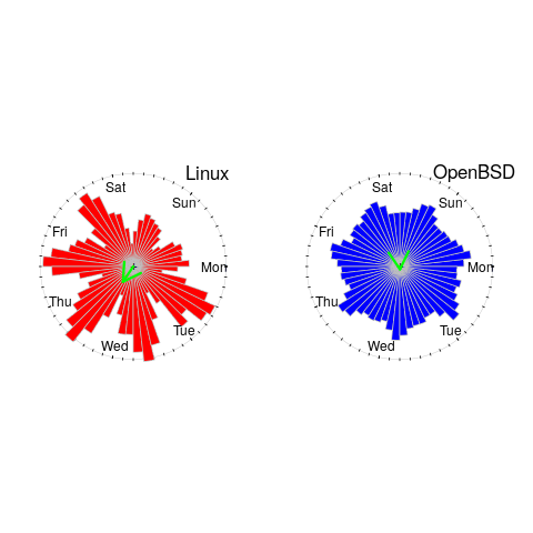
The Linux kernel source has far fewer commits at the weekend, compared to working days. Given the number of people whose job is to work on the Linux kernel, compared to the number of people doing it out of interest, this difference is not surprising. The percentage of people working on OpenBSD as a job is small, and there does not appear to be a big difference between weekends and workdays. There is a lot of variation in the number of commits during each 3-hour period of a day, but the number of commits per day does not vary so much; the number of OpenBSD commits per day of week is:
            Mon   Tue   Wed   Thu   Fri   Sat   Sun
26909 26144 25705 25104 24765 22812 24304 |
Does this distribution of commits per day have a uniform distribution (to some confidence level)?
Like all measurements, those made on a circular scale are rounded to some number of digits. Measurements may also be rounded, or binned, to particular units of the scale, e.g., measured to the nearest degree, or nearest minute.
A recent paper, by Landler, Ruxton and Malkemper, found that for samples containing around five hundred or more measurements, rounding to the nearest degree was sufficient to cause the Rao spacing test to almost always report non-uniformity, i.e., for non-trivial samples the rounding was sufficient to cause the test to detect non-uniformity (things worked as expected for samples containing fewer than 100 measurements).
Landler et al found that adding a small amount of noise (drawn from a von Mises distribution) to the rounded measurements appeared to ‘fix’ the incorrect behavior, i.e., rejecting the hypothesis of a uniform distribution, when a uniform distribution may be present.
The rao.spacing.test function, in the circular package, rejected that null hypothesis that the OpenBSD daily data has a uniform distribution. However, when noise is added to each day value (i.e., adding a random fraction to the day values, using rvonmises(length(c_per_day), circular(0), 2.0), although runif(length(c_per_day)) is probably more appropriate {and produces essentially the same result}), the call to rao.spacing.test failed to reject the null hypothesis of uniformity at the 0.05 level (i.e., the daily distribution is probably uniform).
How many research results are affected by this discovery?
I very rarely encounter the use of circular statistics (even though they should probably have been used in places), but then I spend my time reading software engineering papers, whose use of statistics tends to be primitive. I plan to include a brief mention of the use of the Rao spacing test with binned data in the addendum to my Evidence-based software engineering book (which includes the above example).
Where are the industrial strength R compilers?
Why don’t compiler projects for the R language make it into production use? The few that have been written have remained individual experimental products, e.g., RLLVMCompile.
Most popular languages attract many compiler implementations. I’m not saying that any of these implementations have more than a handful of users, that they implement the full language (a full implementation is not common), or that they fulfil any need other than their implementers desire to build something.
A commonly heard reason for the lack of production R compilers is that it is not worth the time and effort, because most of an R program’s time is spent in the library code which is written in a compiled language (e.g., C or Fortran). The fact that it is probably not worth the time and effort has not stopped people writing compilers for other languages, but then I think that the kind of people who use R tend not to be the kind of people who want to spend their time writing compilers. On the whole, they are the kind of people who are into statistics and data analysis.
Is it true that that most R programs spend most of their time executing library code? It’s certainly true for me. But I have noticed that a lot of the library functions executed by my code are written in R. Also, if somebody uses R for all their programming needs (it might be the only language they know), then their code might not be heavily library dependent.
I was surprised to read about Tierney’s byte code compiler, because his implementation is how I thought the R-core’s existing implementation worked (it does now). The internals of R is based on 1980s textbook functional techniques, and like many book implementations of the day, performance is dependent on the escape hatch of compiled code. R’s implementers wisely spent their time addressing user concerns, which revolved around statistics and visual presentation, i.e., not internal implementation technicalities.
Building an R compiler is easy, the much harder and time-consuming part is the runtime system.
Threaded code is a quick and simple approach to compiler implementation. R source gets mapped to a sequence of C function calls, with these functions proving a wrapper to library functions implementing the appropriate basic functionality, e.g., add two vectors. This approach has been the subject of at least one Master’s thesis. Thesis implementations rarely reach production use because those involved significantly underestimate the work that remains to be done, which is usually a lot more than the original implementation.
A simple threaded code approach provides a base for subsequent optimization, with the base having a similar performance to an interpreter. Optimizing requires figuring out details of the operations performed and replacing generic function calls with ones designed to be fast for specific cases, or even better replacing calls with inline code, e.g., adding short vectors of integers. There is a lot of existing work for scripting languages and a few PhD thesis researching R (e.g., Wang). The key technique is static analysis of R source.
Jan Vitek is running what appears to be the most active R compiler research group, at the moment e.g., the Ř project. Research can be good for uncovering language usage and trying out different techniques, but it is not intended to produce industry strength code. Lots of the fancy optimizations in early versions of the gcc C compiler started life as a PhD thesis, with the respective individual sometimes going on to spend a few years creating a production quality version for the released compiler.
The essential ingredient for building a production compiler is persistence. There are an awful lot of details that need to be sorted out (this is why research project code does not directly translate to production code, they ignore ‘minor’ details in order to concentrate on the ‘interesting’ research problem). Is there a small group of people currently beavering away on a production quality compiler for R? If there is, I can understand being discrete, on long-term projects it can be very annoying to have people regularly asking when the software is going to be released.
To have a life, once released, a production compiler needs to attract users, who are often loyal to their current compiler (because they know that their code works for this compiler); there needs to be a substantial benefit to entice people to switch. The benefit of compiling R to machine code, rather than interpreting, is performance. What performance improvement is needed to attract a viable community of users (there is always a tiny subset of users who will pay lots for even small performance improvements)?
My R code is rarely cpu bound, so I am not in the target audience, no matter what the speed-up. I don’t have any insight in the performance problems experienced by the R community, and have no idea whether a factor of two, five, ten or more would be enough.
Evidence-based software engineering: book released
My book, Evidence-based software engineering, is now available; the pdf can be downloaded here, here and here, plus all the code+data. Report any issues here. I’m investigating the possibility of a printed version. Mobile friendly pdf (layout shaky in places).
The original goals of the book, from 10-years ago, have been met, i.e., discuss what is currently known about software engineering based on an analysis of all the publicly available software engineering data, and having the pdf+data+code freely available for download. The definition of “all the public data” started out as being “all”, but as larger and higher quality data was discovered the corresponding were ignored.
The intended audience has always been software developers and their managers. Some experience of building software systems is assumed.
How much data is there? The data directory contains 1,142 csv files and 985 R files, the book cites 895 papers that have data available of which 556 are cited in figure captions; there are 628 figures. I am currently quoting the figure of 600+ for the ‘amount of data’.

Things that might be learned from the analysis has been discussed in previous posts on the chapters: Human cognition, Cognitive capitalism, Ecosystems, Projects and Reliability.
The analysis of the available data is like a join-the-dots puzzle, except that the 600+ dots are not numbered, some of them are actually specs of dust, and many dots are likely to be missing. The future of software engineering research is joining the dots to build an understanding of the processes involved in building and maintaining software systems; work is also needed to replicate some of the dots to confirm that they are not specs of dust, and to discover missing dots.
Some missing dots are very important. For instance, there is almost no data on software use, but there can be lots of data on fault experiences. Without software usage data it is not possible to estimate whether the software is very reliable (i.e., few faults experienced per amount of use), or very unreliable (i.e., many faults experienced per amount of use).
The book treats the creation of software systems as an economically motivated cognitive activity occurring within one or more ecosystems. Algorithms are now commodities and are not discussed. The labour of the cognitariate is the means of production of software systems, and this is the focus of the discussion.
Existing books treat the creation of software as a craft activity, with developers applying the skills and know-how acquired through personal practical experience. The craft approach has survived because building software systems has been a sellers market, customers have paid what it takes because the potential benefits have been so much greater than the costs.
Is software development shifting from being a sellers market to a buyers market? In a competitive market for development work and staff, paying people to learn from mistakes that have already been made by many others is an unaffordable luxury; an engineering approach, derived from evidence, is a lot more cost-effective than craft development.
As always, if you know of any interesting software engineering data, please let me know.
beta: Evidence-based Software Engineering – book
My book, Evidence-based software engineering: based on the publicly available data is now out on beta final release (pdf, and code+data). The plan is for a three-month review, with the final version available in the shops in time for Christmas (I plan to get a few hundred printed, and made available on Amazon).
The next few months will be spent responding to reader comments, and adding material from the remaining 20 odd datasets I have waiting to be analysed.
You can either email me with any comments, or add an issue to the book’s Github page.
While the content is very different from my original thoughts, 10-years ago, the original aim of discussing all the publicly available software engineering data has been carried through (in some cases more detailed data, in greater quantity, has supplanted earlier less detailed/smaller datasets).
The aim of only discussing a topic if public data is available, has been slightly bent in places (because I thought data would turn up, and it didn’t, or I wanted to connect two datasets, or I have not yet deleted what has been written).
The outcome of these two aims is that the flow of discussion is very disjoint, even disconnected. Another reason might be that I have not yet figured out how to connect the material in a sensible way. I’m the first person to go through this exercise, so I have no idea where it’s going.
The roughly 620+ datasets is three to four times larger than I thought was publicly available. More data is good news, but required more time to analyse and discuss.
Depending on the quantity of issues raised, updates of the beta release will happen.
As always, if you know of any interesting software engineering data, please tell me.
Beta release of data analysis chapters: Evidence-based software engineering
When I started my evidence-based software engineering book, nobody had written a data analysis book for software developers, so I had to write one (in fact, a book on this topic has still to be written). When I say “I had to write one”, what I mean is that the 200 pages in the second half of my evidence-based software engineering book contains a concentrated form of such a book.
This 200 pages is now on beta release (it’s 186 pages, if the bibliography is excluded); chapters 8 to 15 of the draft pdf. Originally I was going to wait until all the material was ready, before making a beta release; the Coronavirus changed my plans.
Here is your chance to learn a new skill during the lockdown (yes, these are starting to end; my schedule has not changed, I’m just moving with the times).
All the code+data is available for you to try out any ideas you might have.
The software engineering material, the first half of the book, is also part of the current draft pdf, and the polished form should be available on beta release in about 6 weeks.
If you have a comment or find a problem, either email me or raise an issue on the book’s Github page.
Yes, a few figures and tables still bump into each other. I’m loath to do very fine-tuning because things will shuffle around a bit with minor changes to the words.
I’m thinking of running some online sessions around each chapter. Watch this space for information.
Comments on the COVID-19 model source code from Imperial
At the end of March a paper modelling the impact of various scenarios on the spread of COVID-19 infections, by the MRC Centre for Global Infectious Disease Analysis at Imperial College, appears to have influenced the policy of the powers that be. This group recently started publishing their modelling code on GitHub (good for them).
Most of my professional life has been spent analyzing other peoples’ code, for one reason or another (mostly Fortran, then Pascal, and then C). I had heard that the Imperial software was written in C, but the released code is written in R (as of six hours ago, there is the start of a Python version). Ok, I can work with R, but my comments will be general, since I don’t have lots of in depth experience reading R code.
The code comes from a research context, and is evolving, i.e., some amount of messiness is to be expected.
There is not a lot of code to talk about (248 lines setting things up, 111 lines for a Stan model, 371 lines of plotting code, and 85 lines of utility code). The analysis is performed by creating a model using the Stan statistical inference language (in which the high level structure of the problem is specified, compiled to a lower level form and then run; the Stan language is very similar to R). These days, lots of problems are coded using a relatively small number of lines that call fancy libraries to do the heavy lifting. It is becoming rare to have to write tens of thousands of lines of code to solve a problem.
I have two points to make about the code, all designed to reduce the likelihood of mistakes being made by the person working on the source. These points mainly apply to the Stan code, because that is where the important stuff happens, but are equally applicable to all code.
- Numeric literals are embedded in the code, values include:
2.4,1.0,0.5,0.03,1e-5, and1e-9. These values obviously mean something to the person who wrote the code, and they can probably be interpreted by experts in the spread of virus infections. But why are they scattered about the code, rather than appearing together (as a sequence of assignments to variables with meaningful names)? Having all the constants in one place makes it easier to spot when a mistake has been made, e.g., one value has been changed without a corresponding change in another value; it also makes it easier for people new to the code to figure out what is going on, - when commenting out code, make it very obvious, e.g., have
/**********************on its own line, and*****************************/on its own line. Using just/*and*/makes it easy to miss that code has been commented out.
Why have they started a Python implementation? Perhaps somebody on the team is more comfortable working with Python (when deadlines loom, it is always best to go with what you know).
Having both an R and Python version is good, in that coding mistakes are likely to show up as inconsistencies in the results produced. It’s always good to have the output of two independently written programs to compare (apart from the fact it may cost twice as much).
The README mentions performance issues. I imagine that most of the execution time is spent in the Stan code, so R vs. Python is not a performance issue.
Any reader with expertise tuning Stan models for performance might like to check out the code. I’m sure the Imperial folk would be happy to hear about worthwhile speed-ups.
Update
The R source code of the EuroMOMO model, which aims to “… explain number of deaths by a baseline, influenza activity and extreme ambient temperature.”
Source code chapter of ‘evidence-based software engineering’ reworked
The Source code chapter of my evidence-based software engineering book has been reworked (draft pdf).
When writing the first version of this chapter, I was not certain whether source code was a topic warranting a chapter to itself, in an evidence-based software engineering book. Now I am certain. Source code is the primary product delivery, for a software system, and it is takes up much of the available cognitive effort.
What are the desirable characteristics that source code should have, to minimise production costs per unit of functionality? This is what an evidence-based chapter on source code is all about.
The release of this chapter completes my second pass over the material. Readers will notice the text still contains ... and ?‘s. The third pass will either delete these, or say something interesting (I suspect mostly the former, because of lack of data).
Talking of data, February has been a bumper month for data (apologies if you responded to my email asking for data, and it has not appeared in this release; a higher than average number of people have replied with data).
The plan is to spend a few months getting a beta release ready. Have the beta release run over the summer, with the book in the shops for Christmas.
I’m looking at getting a few hundred printed, for those wanting paper.
The only publisher that did not mind me making the pdf freely available was MIT Press. Unfortunately one of the reviewers was foaming at the mouth about the things I had to say about software engineering researcher (it did not help that I had written a blog post containing a less than glowing commentary on academic researchers, the week of the review {mid-2017}); the second reviewer was mildly against, and the third recommended it.
If any readers knows the editors at MIT Press, do suggest they have another look at the book. I would rather a real publisher make paper available.
Next, getting the ‘statistics for software engineers’ second half of the book ready for a beta release.
Recent Comments