Archive
Some information on story point estimates for 16 projects
Issues in Jira repositories sometimes include an estimate, in story points, but no information on time to complete (an opening/closing date is usually available; in some projects issues pass through various phases, and enter/exit date/time may be available).
Evidence-based software engineering is a data driven approach to figuring out software development processes. At the practical level, data is usually hard to come by; working with whatever data is available, an analysis may feel like making a prophecy based on examining animal entrails.
Can anything be learned from project issue data that just contains story point estimates? Let’s go on a fishing expedition.
My software data collection includes a paper that collected 23,313 story point estimates from 16 projects (the authors tried to predict an estimate, in story points, for an issue based on its description). If nothing else, this data is a sample of what might be encountered in other projects.
Developers estimating with story points often select values from the Fibonacci sequence, while developers estimating using hours/minutes often use round numbers. The granularity of both the Fibonacci values and round numbers follow the same exponential growth pattern. In terms of granularity, estimating story points in Fibonacci values need not far removed from estimating time in round numbers.
The number of story points per project varied from 352 to 4,667, with a mean of 1,457.
The plots below show the number of issues (y-axis, normalised across projects) estimated to require a given number of story points (x-axis), for 16 projects, with projects clustered by peak story point value (i.e., a project’s most frequently used story point value; code+data):
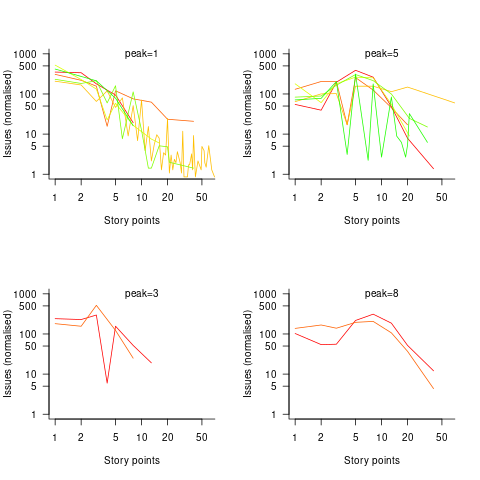
Are the projects with estimate peaks at 3 and 8 story points a quirk of this dataset, or is it to be expected that around 10% of projects will peak at one of these values?
For me, what jumps out of these plots is the number and extent of 4 story point estimates. Perhaps it’s just a visual effect, the actual number is an order of magnitude less than for 3 and 5 story points.
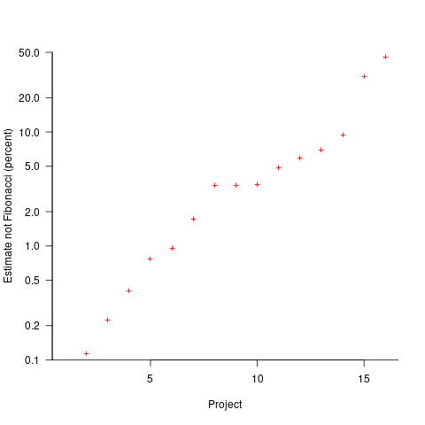
The plot below shows the percentage of estimated story points that are not Fibonacci numbers, sorted by project (the one project not showing has 0%; code+data):
If nothing else, these plots provide a base to start from, and potentially claim to have seen this pattern before.
Documentation as a signal of program size
Developers and researchers invariably measure program size in lines of code, while senior managers measure by resources consumed per accounting period, e.g., money and people.
What size signals are visible to the users of a program?
Before CDs became generally available at the start of the 1990s, software for desktop computers was delivered on floppy discs that did not have the capacity to hold documentation (i.e., 128K to 1.4M), which was distributed in printed book form.
For instance, the first version of Turbo Pascal came with one 5¼ floppy (the compiler+IDE occupied 28K) and a 276-page reference manual.
Today, people are familiar with the intangible nature of software. In previous ages, people wanted to see and feel something for their money, and printed manuals were the substance they received (some products attached the floppies inside the back covers). Physical manuals were also thought to reduce software piracy (when CDs arrived, there was lots of hand-wringing over including electronic manuals).
Microsoft Windows bucked the trend, distributed with almost no physical paper, but many floppies; 13 3½ floppies for the initial upgrade to Windows 95, and 26 for Service Release 2 (oh, the fun of spending an afternoon swapping disks to rebuild a machine). Microsoft Office 97 standard edition was available on 45 floppies, the professional edition on 55.
The problem with distributing manuals in printed book form is that updates are costly; customers need a whole new book and the existing inventory needs to be scrapped. Documentation for Mainframe/Minicomputer/Workstations came in ring binders, allowing updates on an individual page basis. The Sun 4 that arrived at my office (to have a COBOL code generator written for the SPARC cpu) came with around 3-feet of ring binders. I have seen offices with a wall of shelves filled with vendor ring binders.
Is there any correlation between a project’s lines of code and pages of it’s documentation?
Most developers hate writing documentation; readmes don’t count. This means that only (well) funded development projects are likely to pay for an author to produce some amount of non-trivial documentation (a widely used application eventually attracts an external author interested in explaining things). Some Open source projects do contain files believed to be documentation; documentation research is primarily focused on accuracy (see section 6.4.4).
The only data I am aware of containing LOC, documentation page counts, and development man months is the 1979 paper The Characteristics of Large Systems by Belady and Lehman, which lists values for 37 “… independent programs developed in a large software house.” How much of the documentation was user focused, requirements+business logic, or developer focused? I have no idea (a fitted regression model, code+data, shows an almost linear relationship between LOC and document pages). Tests are not broken out as a separate item (code, documentation, not recorded?)
The plot below shows delivered: source lines of code, documentation pages, and total man months, x/y-axis both using log scales (code+data):

The total man months of implementation for each project is taken up by writing the code and documentation. The following equation is a good fit (explaining just 80% of the variance; code+data):  , but is only slightly better than
  . Given the high correlation between
  and
and  , including both in the same model is probably not a good idea (the equation:
  explains just over 50% of the variance).
There are a few possible outliers in the data. Perhaps removing these would make the picture clearer.
For me, what stands out, compared to today’s projects, is the relatively low DSLOC (a few tens of thousands) and high pages of documentation (thousands). Projects could be smaller/simpler in the 1970s because they were often replacing humans doing the work, not previously written systems; or, perhaps projects were limited by available computer memory, often well less than a megabyte. Perhaps I think the page count is high because I don’t have an accurate idea of how much online documentation is created these days.
Rereading The Mythical Man-Month
The book The Mythical Man-Month by Fred Brooks, first published in 1975, continues to be widely referenced, my 1995 edition cites over 250K copies in print. In the past I have found it to be a pleasant, relatively content free, read.
Having spent some time analyzing computing data from the 1960s, I thought it would be interesting to reread Brooks in the light of what I had recently learned. I cannot remember when I last read the book, and only keep a copy to be able to check when others cite it as a source.
Each of the 15 chapters, in the 1975 edition, takes the form of a short five/six page management briefing on some project related topic; chapters start with a picture of some work or art on one page, and a short quote from a famous source occupies the opposite page. The 20th anniversary edition adds four chapters, two of which ‘refire’ Brooks’ 1986 paper introducing the term No Silver Bullet (that no single technlogy will produce an order of magnitude improvement in productivity).
Rereading, I found the 1975 contents to be sufficiently non-specific that my newly acquired knowledge did not change anything. It was a pleasant read, various ideas and some data points are presented, the work of others is covered and cited, a few points are briefly summarised and the chapter ends. The added chapters have a different character than the earlier ones, being more detailed in their discussion and more specific in suggesting outcomes. The ‘No Silver Bullet’ material dismisses some of the various claimed discoveries of a silver bullet.
Why did the book sell so well?
The material is an easy read, and given that no solutions are heavily pushed, there is little to disagree with.
Being involved on a project for the first time can be a confusing experience, and even more experienced people get lost. Brooks can provide solace through his calm presentation of project behaviors as stuff that happens.
What project experience did Brooks have?
Brooks’ PhD thesis The Analytic Design of Automatic Data Processing Systems was completed in 1956, and, aged 25, he joined IBM that year. He was project manager for System/360 from its inception in late 1961 to its launch in April 1964. He managed the development of the operating system OS/360 from February 1964, for a year, before leaving to found the computer science department at the University of North Carolina at Chapel Hill, where he remained.
So Brooks gained a few years of hands-on experience at the start of his career and spent the rest of his life talking about it. A not uncommon career path.
Managing the development of an O/S intended to control a machine containing 16K of memory (i.e., IBM’s System/360 model 30) might not seem like a big deal. Teams of half-a-dozen good people had implemented projects like this since the 1950s. However, large companies create large teams, operating over multiple sites, with every changing requirements and interfaces, changing hardware, all with added input from marketing (IBM was/is a sales-driven organization). I suspect that the actual coding effort was a rounding error, compared to the time spent in meetings and on telephone calls.
Brooks looked after the management, and Gene Amdahl looked after the technical stuff (for lots of details see IBM’s 360 and early 370 systems by Pugh, Johnson, and Palmer).
Brooks was obviously a very capable manager. Did the O/360 project burn him out?
Research ideas for 2023/2024
Students sometimes ask me for suggestions of interesting research problems in software engineering. A summary of my two recurring suggestions, for this year, appears below; 2016/2017 and 2019/2020 versions.
How many active users does a program or application have?
The greater the number of users, the greater the number of reported faults. Estimates of program reliability have to include volume of usage as an integral part of the calculation.
Non-trivial amounts of public data on program usage is non-existent (in a few commercial environments, users are charged for using software on a per-usage basis, but this data is confidential). Usage has to be estimated by indirect means.
A popular indirect technique for estimating the popularity of Github repos is to count the number of stars it has; however, stars have a variety of interpretations. The extent to which Github stars tracks usage of the repo’s software is not known.
Other indirect techniques include: web server logs, installs of the application, or the operating system.
One technique that has not yet been researched is to make use of the identity of those reporting faults. A parallel can be drawn with the fish population in lakes, which is not directly visible. Ecologists have developed techniques for indirectly estimating the population size of distinct creatures using information about a subset of the population, and some of the population models developed for ecology can be adapted to estimating program user populations.
Estimates of population size can be obtained by plugging information on the number of different people reporting faults, and the number of reports from the same person into these models. This approach is not as easy as it sounds because sometimes the same person has multiple identities, reported faults also need to be deduplicated and cleaned (30-40% of reports have been found to be requests for enhancements).
Nested if-statement execution
As if-statement nesting depth increases, the number of conditions controlling the execution of the enclosed code increases.
Being able to estimate the likelihood of executing the code controlled by an if-statement is of interest to: compilers wanting to target optimizations along the most frequently executed paths, special handling for error paths, testing along the least/most likely paths (e.g., fuzzers wanting to know the conditions needed to reach a given block), those wanting to organize code for ease of understanding, by reducing cognitive effort to understand.
Possible techniques for analysing the likelihood of executing code controlled by one or more nested if-statements include:
- Compiler writers have discovered various heuristics for predicting the likely outcome of a branch, and there are probably more to be discovered. Statement coverage counts provides a ground truth against which to compare ideas,
- analysis of the conditional expression,
- mathematical analysis of the distribution of values of variables in conditional expressions.
Small team estimating in story points; a project dataset
Just before the end of last year a regular reader, Mr A., emailed to ask if I would be interested in analysing the software project data for the company he worked for. The wishing to be anonymous company sold physical products, and bespoke software that supported the business was written by a team of three.
Two factors made this dataset interesting, 1) it was for a small team, 2) story points were used for estimating tasks and actual time was recorded (I had not seen such data before).
There are probably hundreds of thousands of small software teams working in companies whose main line of business is far removed from software (a significant percentage of developers work within a small team supporting the activities of non-software companies; I cannot find the bls page listing developer employment across industry codes). These small teams are rarely studied. Software engineering research usually focuses on the practices of software based companies, or large software development projects, i.e., groups likely to be easily visible to external researchers.
To be widely applicable, evidence-based software engineering has to be of practical use to small development teams, not just large development groups.
The wide variety of opinions on the accuracy of story point estimates are unsupported by data; at least I have not yet been able to find any. Here was an opportunity to analyse story point estimates against actual hours.
The reason for analysing task implementation data is to help those involved understand what is going on, with the intent of improving processes. A small team presents two major challenges:
- relatively high levels of variability in the data. When there are only a few people working on a project, the impact of individual events can have a dramatic impact on project metrics, e.g., somebody going on holiday results in a big drop in work performed. Statistical analysis looks for general patterns in data, and small sample sizes have a higher variance than large sample sizes. With a large team, the impact of individual events tends to be smoothed out by the activities of many other events,
- the project lead of a small team is likely to have a good understanding of what is going on. Mr A. was always able to give me detailed explanations behind the patterns I found in the data. There is a lot more going on in a large team, and the team lead is unlikely to have a detailed understanding of everything.
The dataset contained some of the usual patterns found in other datasets (code+data):
- Round numbers. Actual task time finishing on 15/10/30/20 minute boundaries. With stories estimated at between one and five story points, there was little scope for round number use here.
- Consistent under/over estimation. A small sample size limited the chances of seeing both under and over estimation, and only under estimation was seen.
- Estimation accuracy. The factor of two/four accuracy pattern seen is close to that seen in data from other companies.
What did I learn from the analysis of this dataset?
I was pleased to see that the multiplication factors around estimation accuracy were similar to those seen with time-based estimates. I had no feel for how estimation accuracy might compare. We will have to wait and see whether the same pattern is found in other projects using story point estimates.
The analysis conversation for other project datasets had involved exchange of emails. Updating a Markdown formatted project analysis file has proved to be a more usable approach for the conversation between me and the domain expert. I used Visual Studio Code to edit this file and generate a pdf.
I asked Mr A. what would he thought was the most useful part of the analysis, for him.
Mr A. “The most useful part of the analysis? I think it was great to get an outsider’s perspective on the data.”
I hope that this dataset is the first of many from small team projects. With enough experience, it ought to be possible to create a template spreadsheet/markdown file that is generally usable for non-experts.
Analysis of Cost Performance Index for 338 projects
Project are estimated using a variety of resources. For those working at the sharp end, time is the pervasive resource. From the business perspective, the primary resource focus is on money; spending money to develop software that will make/save money.
Cost estimation data is much rarer than time estimation data (which itself is very thin on the ground).
The paper “An empirical study on a single company’s cost estimations of 338 software projects” (no public pdf currently available) by Christian Schürhoff, Stefan Hanenberg (who kindly sent me a copy of the data), and Volker Gruhn immediately caught my attention. What I am calling the Adesso dataset contains 4,713 rows relating to 338 fixed-price software projects implemented by Adesso SE (a German software and consulting company) between 2011 and the middle of 2016.
Cost estimation data is so very rare because of its commercial sensitivity. This paper deals with the commercial sensitivity issue by not releasing actual cost data, but by releasing data on a ratio of costs; the Cost Performance Index (CPI):

where:  are the actual costs (i.e., money spent) up to the current time, and
  is the earned value (a marketing term for the costs estimated for the planned work that has actually been completed up to the current time).
if  , then more was spent than estimated (i.e., project is behind schedule or was underestimated), while if
  , then less was spent than estimated (i.e., project is ahead of schedule or was overestimated).
The progress of a project’s implementation, in monetary terms, can be tracked by regularly measuring its CPI.
The Adesso dataset lists final values for each project (number of days being the most interesting), and each project’s CPI at various percent completed points. The plot below shows the number of CPI estimates for each project, against project duration; the assigned project numbers clustered into four bands and four colors are used to show projects in each band (code+data):
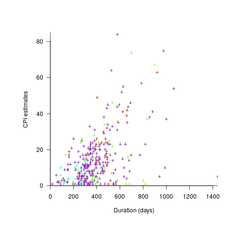
Presumably, projects that made only a handful of CPI estimates used other metrics to monitor project progress.
What are the patterns of change in a project’s CPI during its implementation? The plot below shows every CPI for each of 15 projects, with at least 44 CPI estimates, during implementation (code+data):
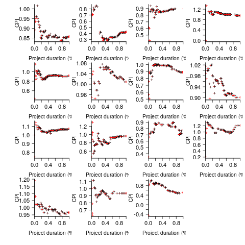
A commonly occurring theme, that will be familiar to those who have worked on projects, is that large changes usually occur at the start of the project, and then things settle down.
To continue as a going concern, a commercial company needs to make a profit. Underestimating a project may result in its implementation losing money. Losing money on some projects is not a problem, provided that the loses are cancelled out by overestimated projects making more money than planned.
While the mean CPI for the Adesso projects is 1.02 (standard deviation of 0.3), projects vary in size (and therefore costs). The data does not include project man-hours, but it does include project duration. The weighted mean, using duration as a proxy for man-hours, is 0.96 (standard deviation 0.3).
Companies cannot have long sequences of underestimated projects, creditors and shareholders will eventually call a halt. The Adesso dataset does not include any date information, so it is not possible to estimate the average CPI over shorter durations, e.g., one year.
I don’t have any practical experience of tracking project progress using earned value or CPI, and have only read theory papers on the subject (many essentially say that earned value is a great metric and everybody ought to be using it). Tips and suggestions welcome.
Studying the lifetime of Open source
A software system can be said to be dead when the information needed to run it ceases to be available.
Provided the necessary information is available, plus time/money, no software ever has to remain dead, hardware emulators can be created, support libraries can be created, and other necessary files cobbled together.
In the case of software as a service, the vendor may simply stop supplying the service; after which, in my experience, critical components of the internal service ecosystem soon disperse and are forgotten about.
Users like the software they use to be actively maintained (i.e., there are one or more developers currently working on the code). This preference is culturally driven, in that we are living through a period in which most in-use software systems are actively maintained.
Active maintenance is perceived as a signal that the software has some amount of popularity (i.e., used by other people), and is up-to-date (whatever that means, but might include supporting the latest features, or problem reports are being processed; neither of which need be true). Commercial users like actively maintained software because it enables the option of paying for any modifications they need to be made.
Software can be a zombie, i.e., neither dead or alive. Zombie software will continue to work for as long as the behavior of its external dependencies (e.g., libraries) remains sufficiently the same.
Active maintenance requires time/money. If active maintenance is required, then invest the time/money.
Open source software has become widely used. Is Open source software frequently maintained, or do projects inhabit some form of zombie state?
Researchers have investigated various aspects of the life cycle of open source projects, including: maintenance activity, pull acceptance/merging or abandoned, and turnover of core developers; also, projects in niche ecosystems have been investigated.
The commits/pull requests/issues, of circa 1K project repos with lots of stars, is data that can be automatically extracted and analysed in bulk. What is missing from the analysis is the context around the creation, development and apparent abandonment of these projects.
Application areas and development tools (e.g., editor, database, gui framework, communications, scientific, engineering) tend to have a few widely used programs, which continue to be actively worked on. Some people enjoy creating programs/apps, and will start development in an area where there are existing widely used programs, purely for the enjoyment or to scratch an itch; rarely with the intent of long term maintenance, even when their project attracts many other developers.
I suspect that much of the existing research is simply measuring the background fizz of look-alike programs coming and going.
A more realistic model of the lifecycle of Open source projects requires human information; the intent of the core developers, e.g., whether the project is intended to be long-term, primarily supported by commercial interests, abandoned for a successor project, or whether events got in the way of the great things planned.
Finding patterns in construction project drawing creation dates
I took part in Projecting Success‘s 13th hackathon last Thursday and Friday, at CodeNode (host to many weekend hackathons and meetups); around 200 people turned up for the first day. Team Designing-Success included Imogen, Ryan, Dillan, Mo, Zeshan (all building construction domain experts) and yours truly (a data analysis monkey who knows nothing about construction).
One of the challenges came with lots of real multi-million pound building construction project data (two csv files containing 60K+ rows and one containing 15K+ rows), provided by SISK. The data contained information on project construction drawings and RFIs (request for information) from 97 projects.
The construction industry is years ahead of the software industry in terms of collecting data, in that lots of companies actually collect data (for some, accumulate might be a better description) rather than not collecting/accumulating data. While they have data, they don’t seem to be making good use of it (so I am told).
Nearly all the discussions I have had with domain experts about the patterns found in their data have been iterative, brief email exchanges, sometimes running over many months. In this hack, everybody involved is sitting around the same table for two days, i.e., the conversation is happening in real-time and there is a cut-off time for delivery of results.
I got the impression that my fellow team-mates were new to this kind of data analysis, which is my usual experience when discussing patterns recently found in data. My standard approach is to start highlighting visual patterns present in the data (e.g., plot foo against bar), and hope that somebody says “That’s interesting” or suggests potentially more interesting items to plot.
After several dead-end iterations (i.e., plots that failed to invoke a “that’s interesting” response), drawings created per day against project duration (as a percentage of known duration) turned out to be of great interest to the domain experts.
Building construction uses a waterfall process; all the drawings (i.e., a kind of detailed requirements) are supposed to be created at the beginning of the project.
Hmm, many individual project drawing plots were showing quite a few drawings being created close to the end of the project. How could this be? It turns out that there are lots of different reasons for creating a drawing (74 reasons in the data), and that it is to be expected that some kinds of drawings are likely to be created late in the day, e.g., specific landscaping details. The 74 reasons were mapped to three drawing categories (As built, Construction, and Design Development), then project drawings were recounted and plotted in three colors (see below).
The domain experts (i.e., everybody except me) enjoyed themselves interpreting these plots. I nodded sagely, and occasionally blew my cover by asking about an acronym that everybody in the construction obviously knew.
The project meta-data includes a measure of project performance (a value between one and five, derived from profitability and other confidential values) and type of business contract (a value between one and four). The data from the 97 projects was combined by performance and contract to give 20 aggregated plots. The evolution of the number of drawings created per day might vary by contract, and the hypothesis was that projects at different performance levels would exhibit undesirable patterns in the evolution of the number of drawings created.
The plots below contain patterns in the quantity of drawings created by percentage of project completion, that are: (left) considered a good project for contract type 1 (level 5 are best performing projects), and (right) considered a bad project for contract type 1 (level 1 is the worst performing project). Contact the domain experts for details (code+data):
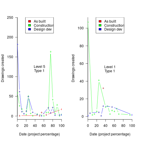
The path to the above plot is a common one: discover an interesting pattern in data, notice that something does not look right, use domain knowledge to refine the data analysis (e.g., kinds of drawing or contract), rinse and repeat.
My particular interest is using data to understand software engineering processes. How do these patterns in construction drawings compare with patterns in the software project equivalents, e.g., detailed requirements?
I am not aware of any detailed public data on requirements produced using a waterfall process. So the answer is, I don’t know; but the rationales I heard for the various kinds of drawings sound as-if they would have equivalents in the software requirements world.
What about the other data provided by the challenge sponsor?
I plotted various quantities for the RFI data, but there wasn’t any “that’s interesting” response from the domain experts. Perhaps the genius behind the plot ideas will be recognized later, or perhaps one of the domain experts will suddenly realize what patterns should be present in RFI data on high performance projects (nobody is allowed to consider the possibility that the data has no practical use). It can take time for the consequences of data analysis to sink in, or for new ideas to surface, which is why I am happy for analysis conversations to stretch out over time. Our presentation deck included some RFI plots because there was RFI data in the challenge.
What is the software equivalent of construction RFIs? Perhaps issues in a tracking system, or Jira tickets? I did not think to talk more about RFIs with the domain experts.
How did team Designing-Success do?
In most hackathons, the teams that stay the course present at the end of the hack. For these ProjectHacks, submission deadline is the following day; the judging is all done later, electronically, based on the submitted slide deck and video presentation. The end of this hack was something of an anti-climax.
Did team Designing-Success discover anything of practical use?
I think that finding patterns in the drawing data converted the domain experts from a theoretical to a practical understanding that it was possible to extract interesting patterns from construction data. They each said that they planned to attend the next hack (in about four months), and I suggested that they try to bring some of their own data.
Can these drawing creation patterns be used to help monitor project performance, as it progressed? The domain experts thought so. I suspect that the users of these patterns will be those not closely associated with a project (those close to a project are usually well aware of that fact that things are not going well).
Multiple estimates for the same project
The first question I ask, whenever somebody tells me that a project was delivered on schedule (or within budget), is which schedule (or budget)?
New schedules are produced for projects that are behind schedule, and costs get re-estimated.
What patterns of behavior might be expected to appear in a project’s reschedulings?
It is to be expected that as a project progresses, subsequent schedules become successively more accurate (in the sense of having a completion date and cost that is closer to the final values). The term cone of uncertainty is sometimes applied as a visual metaphor in project management, with the schedule becoming less uncertain as the project progresses.
The only publicly available software project rescheduling data, from Landmark Graphics, is for completed projects, i.e., cancelled projects are not included (121 completed projects and 882 estimates).
The traditional project management slide has some accuracy metric improving as work on a project approaches completion. The plot below shows the percentage of a project completed when each estimate is made, against the ratio  ; the y-axis uses a log scale so that under/over estimates appear symmetrical (code+data):
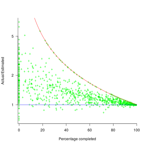
The closer a point to the blue line, the more accurate the estimate. The red line shows maximum underestimation, i.e., estimating that the project is complete when there is still more work to be done. A new estimate must be greater than (or equal) to the work already done, i.e.,  , and
, and  .
.
Rearranging, we get:  (plotted in red). The top of the ‘cone’ does not represent managements’ increasing certainty, with project progress, it represents the mathematical upper bound on the possible inaccuracy of an estimate.
In theory there is no limit on overestimating (i.e., points appearing below the blue line), but in practice management are under pressure to deliver as early as possible and to minimise costs. If management believe they have overestimated, they have an incentive to hang onto the time/money allocated (the future is uncertain).
Why does management invest time creating a new schedule?
If information about schedule slippage leaks out, project management looks bad, which creates an incentive to delay rescheduling for as long as possible (i.e., let’s pretend everything will turn out as planned). The Landmark Graphics data comes from an environment where management made weekly reports and estimates were updated whenever the core teams reached consensus (project average was eight times).
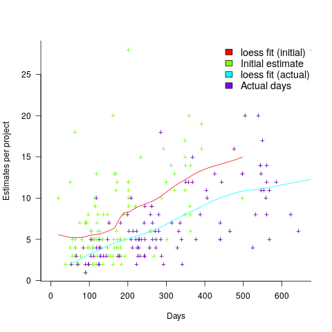
The longer a project is being worked on, the greater the opportunity for more unknowns to be discovered and the schedule to slip, i.e., longer projects are expected to acquire more re-estimates. The plot below shows the number of estimates made, for each project, against the initial estimated duration (red/green) and the actual duration (blue/purple); lines are loess fits (code+data):
What might be learned from any patterns appearing in this data?
When presented with data on the sequence of project estimates, my questions revolve around the reasons for spending time creating a new estimate, and the amount of time spent on the estimate.
A lot of time may have been invested in the original estimate, but how much time is invested in subsequent estimates? Are later estimates simply calculated as a percentage increase, a politically acceptable value (to the stakeholder funding for the project), or do they take into account what has been learned so far?
The information needed to answer these answers is not present in the data provided.
However, this evidence of the consistent provision of multiple project estimates drives another nail in to the coffin of estimation research based on project totals (e.g., if data on project estimates is provided, one estimate per project, were all estimates made during the same phase of the project?)
The CESAW dataset: a brief introduction
I have found that the secret for discovering data treasure troves is persistently following any leads that appear. For instance, if a researcher publishes a data driven paper, then check all their other papers. The paper: Composing Effective Software Security Assurance Workflows contains a lot of graphs and tables, but no links to data, however, one of the authors (William R. Nichols) published The Cost and Benefits of Static Analysis During Development which links to an amazing treasure trove of project data.
My first encounter with this data was this time last year, as I was focusing on completing my Evidence-based software engineering book. Apart from a few brief exchanges with Bill Nichols the technical lead member of the team who obtained and originally analysed the data, I did not have time for any detailed analysis. Bill was also busy, and we agreed to wait until the end of the year. Bill’s and my paper: The CESAW dataset: a conversation is now out, and focuses on an analysis of the 61,817 task and 203,621 time facts recorded for the 45 projects in the CESAW dataset.
Our paper is really an introduction to the CESAW dataset; I’m sure there is a lot more to be discovered. Some of the interesting characteristics of the CESAW dataset include:
- it is the largest publicly available project dataset currently available, with six times as many tasks as the next largest, the SiP dataset. The CESAW dataset involves the kind of data that is usually encountered, i.e., one off project data. The SiP dataset involves the long term evolution of one company’s 20 projects over 10-years,
- it includes a lot of information I have not seen elsewhere, such as: task interruption time and task stop/start {date/time}s (e.g., waiting on some dependency to become available)
- four of the largest projects involve safety critical software, for a total of 28,899 tasks (this probably more than two orders of magnitude more than what currently exists). Given all the claims made about the development about safety critical software being different from other kinds of development, here is a resource for checking some of the claims,
- the tasks to be done, to implement a project, are organized using a work-breakdown structure. WBS is not software specific, and the US Department of Defense require it to be used across all projects; see MIL-STD-881. I will probably annoy those in software management by suggesting the one line definition of WBS as: Agile+structure (WBS supports iteration). This was my first time analyzing WBS project data, and never having used it myself, I was not really sure how to approach the analysis. Hopefully somebody familiar with WBS will extract useful patterns from the data,
- while software inspections are frequently talked about, public data involving them is rarely available. The WBS process has inspections coming out of its ears, and for some projects inspections of one kind or another represent the majority of tasks,
- data on the kinds of tasks that are rarely seen in public data, e.g., testing, documentation, and design,
- the 1,324 defect-facts include information on: the phase where the mistake was made, the phase where it was discovered, and the time taken to fix.
As you can see, there is lots of interesting project data, and I look forward to reading about what people do with it.
Once you have downloaded the data, there are two other sources of information about its structure and contents: the code+data used to produce the plots in the paper (plus my fishing expedition code), and a CESAW channel on the Evidence-based software engineering Slack channel (no guarantees about response time).
Recent Comments