Archive
Halstead/McCabe: a complicated formula for LOC
My experience is that people prefer to ignore the implications of Halstead’s metric and McCabe’s complexity metric being strongly correlated (non-linearly) with lines of code (LOC). The implications being that they have been deluding themselves and perhaps wasting time/money using Halstead/McCabe when they could just as well have used LOC.
If the purpose of collecting metrics is a requirement to tick a box, then it does not really matter which metrics are collected. The Halstead/McCabe metrics have a strong brand, so why not collect them.
Don’t make the mistake of thinking that Halstead/McCabe is more than a complicated way of calculating LOC. This can be shown by replacing Halstead/McCabe by the corresponding LOC value to find that it makes little difference to the value calculated.
Some metrics include the Halstead metrics and/or the McCabe metric as part of their calculation. The Maintainability Index is a metric calculated using Halstead’s volume, McCabe’s complexity and lines of code. Its equation is (see below for details):
-0.23*McCabe-16.2*ln(LOC)")
Replacing the Halstead/McCabe terms by one involving just LOC requires an appropriate mapping. Nearly all researchers assume a linear mapping, despite the overwhelming evidence that the mapping is non-linear.
Fitting regression models for HalsteadVolume vs LOC and McCabe vs LOC, using measurements of 730K methods from 47 Java projects (see below for data details), produces the coefficients for the equation needed to map each metric to LOC (previous analysis has found that a power law provides the best mapping; code+data). Substituting these equations in the Maintainability Index equation above, we get:
)-0.23*(0.45*LOC^{0.71})-16.2*ln(LOC)")
which simplifies to:
-0.1*LOC^{0.71}")
How does the value calculated using  compare with the corresponding
  value?
For 99.7% of methods, the relative error,  , for the 730K Java methods is less than 10%, and for 98.6% of methods the relative error is less than 5% (code+data).
Given the fuzzy nature of these metrics, 10% is essentially noise.
Looking at the relative contributions made by Halstead/McCabe/LOC to the value of the Maintainability Index, second equation above, the Halstead contribution is around a third the size of the LOC contribution and the McCabe contribution is at least an order of magnitude smaller.
Background on the Maintainability Index and the measured Java projects.
The Maintainability Index was introduced in the 1994 paper “Construction and Testing of Polynomials Predicting Software Maintainability” by Oman, and Hagemeister (270 citations; no online pdf), a 1992 paper by the same authors is often incorrectly cited (426 citations). The earlier 1992 paper identified 92 known maintainability attributes, along with 60 metrics for “… gauging software maintainability …” (extracted from 35 published papers).
This Maintainability Index equation was chosen from “Approximately 50 regression models were constructed and tested in our attempts to identify simple models that could be calculated from existing tools and still be generic enough to be applied to a wide range of software.” The data fitted came from eight suites of programs (average LOC 3,568 per suite), along “… with subjective engineering assessments of the quality and maintainability of each set of code.”
Yes, choosing from 50 regression models looks like overfitting, and by today’s standards 28.5K LOC is a tiny amount of source.
The data used is distributed with the paper Revisiting the Debate: Are Code Metrics Useful for Measuring Maintenance Effort? by Chowdhury, Holmes, Zaidman, and Kazman, which does a good job of outlining the many different definitions of maintenance and the inconsistent results from prediction models. However, the authors remain under the street light of project source code, i.e., they ignore the fact that many maintenance requests are driven by demand for new features.
The authors investigate the impact of normalizing Halstead/McCabe by LOC, but make the common mistake of assuming a linear relationship. They are surprised by the high correlation between post-‘normalised’ Halstead/McCabe and LOC. The correlation disappears when the appropriate non-linear normalization is used; see code+data.
A 2014 paper by Najm also maps the components of the Maintainability Index to LOC, but uses a linear mapping from the Halstead/McCabe terms to LOC, creating a equation whose behavior is noticeably different.
Halstead & McCabe metrics: The wisdom of the ancients
Study after study finds that the predictive power of both the Halstead metric and the McCabe cyclomatic complexity metric is no better than counting lines of code, for the characteristics of interest. Why do people continue to use and cite the Halstead and McCabe metrics?
My experience, talking to people, is that many believe these metrics have greater predictive power than lines of code. Sometimes I explain the situation, other times I move on.
Those who are aware of the facts often continue to use these metrics. Why do they do this?
Given the lack of alternative metrics that are more effective than lines of code, for the claimed uses of Halstead/McCabe, following the herd is the easy option (I regularly point this out to people, after explaining that Halstead/McCabe don’t do what is claimed on the tin). Tools are available to calculate the metrics; the manual effort is clicking buttons or running a command.
Why were the Halstead/McCabe metrics ‘successful’, in that they are the ones people cite/use today?
Both were formulated in the mid-1970s, when the discussion around measuring software started in earnest, so they had some first-mover advantage (within a few years they were both being suggested for use by US Military). Individuals promoted their ideas: Maurice Halstead was a senior professor, with colleagues and lots of graduate students, who advertised the metric via their publications; Thomas McCabe was working for the NSA when his famous paper was published, and went on to form a company working in the area of source code analysis.
The Halstead/McCabe metrics can both be calculated by processing the source one line at a time (just count decision points for McCabe, no need for the pretentious graph theory stuff). In the 1970s, computer memory was often measured in kilobytes, which made it difficult to implement complicated metrics that required keeping dependency information in memory.
Metrics based on the subroutine/function/procedure/method as the measured unit of source code had an implementation and usage advantage over metrics based on larger units of code.
In the 1990s, object-oriented programming, in the form of C++ and then Java, took off. The common view, by those caught up in the times, was that object-oriented software was so different from what went before that it needed its own metrics.
The 1991 paper: Towards a Metrics Suite for Object Oriented Design, by Chidamber and Kemerer, introduced the six CK metrics (as they become known; 1992 update). The nearest this paper comes to citing the Halstead/McCabe work is to say: “Some early work has recognized the shortcomings of existing metrics and the need for new metrics especially designed for OO.” The paper followed in the footsteps of the earlier work in not providing any evidence for the claims made (the update contains histograms of metric values from a C++ project and a Smalltalk project).
The 1996 paper: Evaluating the Impact of Object-Oriented Design on Software Quality, by Abreu and Melo, introduced the MOOD metrics (Metrics for Object-Oriented Design).
At the end of 2022 the total citation counts returned by Google Scholar were: McCabe 8,670, Halstead 4,900, CK 8,160, and MOOD 354.
The plot below shows the number of new citations returned by Google Scholar, each year, for the respective metrics papers (or book for Halstead; code+data):
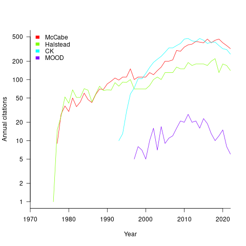
The ongoing growth in annual rate of citation probably has more to do with the growth in the number of software papers published each year, rather than these metric papers being cited by an expanding number of research fields.
Do authors tend to cite one or the other of Halstead/McCabe, or both?
Using Google Scholar’s ‘search within’ option to find the subset of papers that included a string matching the title of a paper: 46% of the Halstead citations include a citation of the McCabe paper, and 25% of the McCabe citations include a citation of the Halstead paper.
The Inciteful’s paper network (with citation counts: Halstead 1,052 and McCabe 4,970) found 657 papers citing both (62% of the Halstead total, 12% of the McCabe).
It’s not possible to make use of the OpenCitations API because it is DOI based, and the Halstead citation is a book.
Evolution of the DORA metrics
There is a growing buzz around the DORA metrics. Where did the DORA metrics come from, what are they, and are they useful?
The company DevOps Research and Assessment LLC (DORA) was founded by Nicole Forsgren, Jez Humble, and Gene Kim in 2016, and acquired by Google in 2018. DevOps is a role that combines software development (Dev) and IT operations (Ops).
The original ideas behind the DORA metrics are described in the 2015 paper DevOps: Profiles in ITSM Performance and Contributing Factors, by Forsgren and Humble. The more well known Accelerate book, published in 2018, is an evangelistic reworking of the material, plus some business platitudes extolling the benefits of using a lean process.
The 2015 paper approaches the metric selection process from the perspective of reducing business costs, and uses a data driven approach. This is how metric selection should be done, and for the first seven or eight pages I was cheering the authors on. The validity of a data driven approaches depends on the reliability of the data and its applicability to the questions being addressed. I don’t think that the reliability of the data used is sufficient to support the conclusions being drawn from it. The data used is the survey results behind the Puppet Labs 2015 State of DevOps Report; the 2018 book included data from the 2016 and 2017 State of DevOps reports.
Between 2015-2018, DORA is more a way of doing DevOps than a collection of metrics to calculate. The theory is based on ideas from the Economic Order Quantity model; this model is used in inventory management to calculate the number of items that should be held in stock, to meet production demand, such that stock holding costs plus item reordering costs are minimised (when the number of items in stock falls below some value, there is an optimum number of items to reorder to replenish stocks).
The DORA mapping of the Economic Order Quantity model to DevOps employs a rather liberal interpretation of the concepts involved. There are three fundamental variables:
- Batch size: the quantity of additions, modifications and deletions of anything that could have an effect on IT services, e.g., changes to code or configuration files,
- Holding cost: the lost opportunity cost of not deploying work that has been done, e.g., lost business because a feature is not available or waste because an efficiency improvement is not used. Cognitive capitalism also has the lost opportunity cost of not learning about the impact of an update on the ecosystem,
- Transaction cost: the cost of building, testing and deploying to production a completed batch.
The aim is to minimise  .
.
So far, so good and reasonable.
Now the details; how do we measure batch size, holding cost and transaction cost?
DORA does not measure these quantities (the paper points out that deployment frequency could be treated as a proxy for batch size, in that as deployment frequency goes to infinity batch size goes to zero). The terms holding cost and transaction cost do not appear in the 2018 book.
Having mapped Economic Order Quantity variables to software, the 2015 paper pivots and maps these variables to a Lean manufacturing process (the 2018 book focuses on Lean). Batch size is now deployment frequency, and higher is better.
Ok, let’s follow the pivoted analysis of Lean ideas applied to software. The 2015 paper uses cluster analysis to find patterns in the 2015 State of DevOps survey data. I have not seen any of the data, or even the questions asked; the description of the analysis is rather sketchy (I imagine it is similar to that used by Forsgren in her PhD thesis on a different dataset). The report published by Puppet Labs analyses the data using linear regression and partial least squares.
Three IT performance profiles are characterized (High, Medium and Low). Why three and not, say, four or five? The papers simply says that three ’emerged’.
The analysis of the Puppet Labs 2015 survey data (6k+ responses) essentially takes the form of listing differences in values of various characteristics between High/Medium/Low teams; responses came from “technical professionals of all specialities involved in DevOps”. The analysis in the 2018 book discussed some of the between year differences.
My experience of asking hundreds of people for data is that most don’t have any. I suspect this is true of those who answered the Puppet Labs surveys, and that answers are guestimates.
The fact that the accuracy of analysis of the survey data is poor does not really matter, because DORA pivots again.
This pivot switches to organizational metrics (from team metrics), becomes purely production focused (very appropriate for DevOps), introduces an Elite profile, and focuses on four key metrics; the following is adapted from Google:
- Deployment Frequency: How often an organization successfully releases to production,
- Lead Time for Changes: The amount of time it takes a commit to get into production,
- Change Failure Rate: The percentage of deployments causing a failure in production,
- Mean time to repair (MTTR): How long it takes an organization to recover from a failure in production.
Are these four metrics useful?
To somebody with zero DevOps experience (i.e., me) they look useful. The few DevOps people I have spoken to are talking about them but not using them (not least because they don’t have the data required).
The characteristics of the Elite/High/Medium/Low profiles reflects Google’s DevOps business interests. Companies offering an online service at a national scale want to quickly respond to customer demand, continuously deploy, and quickly recover from service outages.
There are companies where it makes business sense for DevOps deployments to occur much less frequently than at Google. I also know companies who would love to have deployment rates within an order of magnitude of Google’s, but cannot even get close without a significant restructuring of their build and deployment infrastructure.
Lehman ‘laws’ of software evolution
The so called Lehman laws of software evolution originated in a 1968 study, and evolved during the 1970s; the book “Program Evolution: processes of software change” by Lehman and Belady was published in 1985.
The original work was based on measurements of OS/360, IBM’s flagship operating system for the computer industries flagship computer. IBM dominated the computer industry from the 1950s, through to the early 1980s; OS/360 was the Microsoft Windows, Android, and iOS of its day (in fact, it had more developer mind share than any of these operating systems).
In its day, the Lehman dataset not only bathed in reflected OS/360 developer mind-share, it was the only public dataset of its kind. But today, this dataset wouldn’t get a second look. Why? Because it contains just 19 measurement points, specifying: release date, number of modules, fraction of modules changed since the last release, number of statements, and number of components (I’m guessing these are high level programs or interfaces). Some of the OS/360 data is plotted in graphs appearing in early papers, and can be extracted; some of the graphs contain 18, rather than 19, points, and some of the values are not consistent between plots (extracted data); in later papers Lehman does point out that no statistical analysis of the data appears in his work (the purpose of the plots appears to be decorative, some papers don’t contain them).
One of Lehman’s early papers says that “… conclusions are based, comes from systems ranging in age from 3 to 10 years and having been made available to users in from ten to over fifty releases.“, but no other details are given. A 1997 paper lists module sizes for 21 releases of a financial transaction system.
Lehman’s ‘laws’ started out as a handful of observations about one very large software development project. Over time ‘laws’ have been added, deleted and modified; the Wikipedia page lists the ‘laws’ from the 1997 paper, Lehman retired from research in 2002.
The Lehman ‘laws’ of software evolution are still widely cited by academic researchers, almost 50-years later. Why is this? The two main reasons are: the ‘laws’ are sufficiently vague that it’s difficult to prove them wrong, and Lehman made a large investment in marketing these ‘laws’ (e.g., publishing lots of papers discussing these ‘laws’, and supervising PhD students who researched software evolution).
The Lehman ‘laws’ are not useful, in the sense that they cannot be used to make predictions; they apply to large systems that grow steadily (i.e., the kind of systems originally studied), and so don’t apply to some systems, that are completely rewritten. These ‘laws’ are really an indication that software engineering research has been in a state of limbo for many decades.
Update: Added numbers from appendix of “Software Engineering Metrics and Models” by Conte, Dunsmore, and Shen.
Dimensional analysis of the Halstead metrics
One of the driving forces behind the Halstead complexity metrics was physics envy; the early reports by Halstead use the terms software physics and software science.
One very simple, and effective technique used by scientists and engineers to check whether an equation makes sense, is dimensional analysis. The basic idea is that when performing an operation between two variables, their measurement units must be consistent; for instance, two lengths can be added, but a length and a time cannot be added (a length can be divided by time, returning distance traveled per unit time, i.e., velocity).
Let’s run a dimensional analysis check on the Halstead equations.
The input variables to the Halstead metrics are:  , the number of distinct operators,
  , the number of distinct operands,
  , the total number of operators, and
  , the total number of operands. These quantities can be interpreted as units of measurement in tokens.
The formula are:
- Program length:

There is a consistent interpretation of this equation: operators and operands are both kinds of tokens, and number of tokens can be interpreted as a length. - Calculated program length:

There is a consistent interpretation of this equation: the operand of a logarithm has to be dimensionless, and the convention is to treat the operand as a ratio (if no denominator is specified, the value 1 having the same dimensions as the numerator is taken, giving a dimensionless result), the value returned is dimensionless, which can be multiplied by a variable having any kind of dimension; so again two (token) lengths are being added. - Volume:

A volume has units of (i.e., it is created by multiplying three lengths). There is only one length in this equation; the equation is misnamed, it is a length.
 - Difficulty:

Here the dimensions of and cancel, leaving the dimensions of (a length); now Halstead is interpreting length as a difficulty unit (whatever that might be). - Effort:

This equation multiplies two variables, both having a length dimension; the result should be interpreted as an area. In physics work is force times distance, and power is work per unit time; the term effort is not defined.
Halstead is claiming that a single dimension, program length, contains so much unique information that it can be used as a measure of a variety of disparate quantities.
Halstead’s colleagues at Purdue were rather damming in their analysis of these metrics. Their report Software Science Revisited: A Critical Analysis of the Theory and Its Empirical Support points out the lack of any theoretical foundation for some of the equations, that the analysis of the data was weak and that a more thorough analysis suggests theory and data don’t agree.
I pointed out in an earlier post, that people use Halstead’s metrics because everybody else does. This post is unlikely to change existing herd behavior, but it gives me another page to point people at, when people ask why I laugh at their use of these metrics.
Prioritizing project stakeholders using social network metrics
Identifying project stakeholders and their requirements is a very important factor in the success of any project. Existing techniques tend to be very ad-hoc. In her PhD thesis Soo Ling Lim came up with a very interesting solution using social network analysis and what is more made her raw data available for download 🙂
I have analysed some of Soo Ling’s data below as another draft section from my book Empirical software engineering with R. As always comments and pointers to more data welcome. R code and data here.
A more detailed discussion and analysis is available in Soo Ling Lim’s thesis, which is very readable. Thanks to Soo Ling for answering my questions about her work.
Stakeholder roles and individuals
A stakeholder is a person who has an interest in what an application does. In a well organised development project the influential stakeholders are consulted before any contracts or budgets are agreed. Failure to identify the important stakeholders can result in missing or poorly prioritized requirements which can have a significant impact on the successful outcome of a project.
While many people might consider themselves to be stakeholders whose opinions should be considered, in practice the following groups are the most likely to have their opinions taken into account:
- people having an influence on project funding,
- customers, i.e., those people who are willing pay to use or obtain a copy of the application,
- domain experts, i.e., people with experience in the subject area who might suggest better ways to do something or problems to try and avoid,
- people who have influence over the success or failure over the actual implementation effort, e.g., software developers and business policy makers,
- end-users of the application (who on large projects are often far removed from those paying for it).
In the case of volunteer open source projects the only people having any influence are those willing to do the work. On open source projects made up of paid contributors and volunteers the situation is likely to be complicated.
Individuals have influence via the roles they have within the domain addressed by an application. For instance, the specification of a security card access system is of interest to the role of ‘being in charge of the library’ because the person holding that role needs to control access to various facilities provided within different parts of the library, while the role of ‘student representative’ might be interested in the privacy aspects of the information held by the application and the role of ‘criminal’ has an interest in how easy it is to circumvent the access control measures.
If an application is used by large numbers of people there are likely to be many stakeholders and roles, identifying all these and prioritizing them has, from experience, been found to be time consuming and difficult. Once stakeholders have been identified they then need to be persuaded to invest time learning about the proposed application and to provide their own views.
The RALIC study
A study by Lim <book Lim_10> was based on a University College London (UCL) project to combine different access control mechanisms into one, such as access to the library and fitness centre. The Replacement Access, Library and ID Card (RALIC) project had more than 60 stakeholders and 30,000 users, and has been deployed at UCL since 2007, two years before the study started. Lim created the StakeNet project with the aim of to identifying and prioritising stakeholders.
Because the RALIC project had been completed Lim had access to complete project documentation from start to finish. This documentation, along with interviews of those involved, were used to create what Lim called the Ground truth of project stakeholder role priority, stakeholder identification (85 people) and their rank within a role, requirements and their relative priorities; to quote Lim ‘The ground truth is the complete and prioritised list of stakeholders and requirements for the project obtained by analysing the stakeholders and requirements from the start of the project until after the system is deployed.’
The term salience is used to denote the level of a stakeholder’s influence.
Data
The data consists of three stakeholder related lists created as follows (all names have been made anonymous):
- the Ground truth list: derived from existing RALIC documentation. The following is an extract from this list (individual are ranked within each stakeholder role):
Role Rank,      Stakeholder Role,       Stakeholder Rank,       Stakeholder
1,      Security and Access Systems,    1,              Mike Dawson
1,      Security and Access Systems,    2,              Jason Ortiz
1,      Security and Access Systems,    3,              Nick Kyle
1,      Security and Access Systems,    4,              Paul Haywood
2,      Estates and Facilities Division,1,              Richard Fuller
- the Open list: starting from an initial list of 22 names and 28 stakeholder roles, four iterations of [Snowball sampling] resulted in a total of 61 responses containing 127 stakeholder names+priorities and 70 stakeholder roles,
- the Closed list: a list of 50 possible stakeholders was created from the RALIC project documentation plus names of other UCL staff added as noise. The people on this list were asked to indicated which of those names on the list they considered to be stakeholders and to assign them a salience between 1 and 10, they were also given the option to suggest names of possible stakeholders. This process generated a list containing 76 stakeholders names+priorities and 39 stakeholder roles.
The following is an extract from the last two stakeholder lists:
stakeholder stakeholder role salience David Ainsley Ian More 1 David Ainsley Rachna Kaplan 6 David Ainsley Kathleen Niche 4 David Ainsley Art Waller 1 David Carne Mark Wesley 4 David Carne Lis Hands 4 David Carne Vincent Matthew 4 Keith Lyon Michael Wondor 1 Keith Lyon Marilyn Gallo 1 Kerstin Michel Greg Beech 1 Kerstin Michel Mike Dawson 6 |
Is the data believable?
The data was gathered after the project was completed and as such it is likely to contain some degree of hindsight bias.
The data cleaning process is described in detail by Lim and looks to be thorough.
Predictions made in advance
Lim drew a parallel between the stakeholder prioritisation problem and the various techniques used to rank the nodes in social network analysis, e.g., the Page Rank algorithm. The hypothesis is that there is a strong correlation exists between the rank ordering of stakeholder roles in the Grounded truth list and the rank of stakeholder roles calculated using various social network metrics.
Applicable techniques
How might a list of people and the salience they assign to other people be converted to a single salience for each person? Lim proposed that social network metrics be used. A variety of techniques for calculating social network node centrality metrics have been proposed and some of these, including most used by Lim, are calculated in the following analysis.
Lim compared the Grounded truth ranking of stakeholder roles against the stakeholder role ranking created using the following network metrics:
- betweenness centrality: for a given node it is a count of the number of shortest paths from all nodes in a graph to all other nodes in that graph that pass through the given node; the value is sometimes normalised,
- closeness centrality: for a given node closeness is the inverse of farness, which is the sum of that node’s distances to all other nodes in the graph; the value is sometimes normalised,
- degree centrality: in-degree centrality is a count of the number of edges referring to a node, out-degree centrality is the number of edges that a node refers to; the value is sometimes normalised,
- load centrality: this is a variant of betweenness centrality based on the fraction of shortest paths through a given node. Support for load centrality is not available in the
igraphpackage and so is not used here, this functionality is available in thestatnetpackage, - pagerank: the famous algorithm proposed by Page and Brin <book Page_98> for ranking web pages.
Eigenvector centrality is another commonly used network metric and is included in this analysis.
Results
The igraph package includes functions for computing many of the common social network metrics. Reading data and generating a graph (the mathematical term for a social network) from it is particularly easy, in this case the graph.data.frame function is used to create a representation of its graph from the contents of a file read by read.csv.
The figure below plots Pagerank values for each node in the network created from the Open and Closed stakeholder salience ratings (Pagerank was chosen for this example because it had one of the strongest correlations with the Ground truth ranking). There is an obvious difference in the shape of the curves: the Open saliences (green) is fitted by the equation  (black line), while the Closed saliences (blue) is piecewise fitted by
  and
and  (red lines).
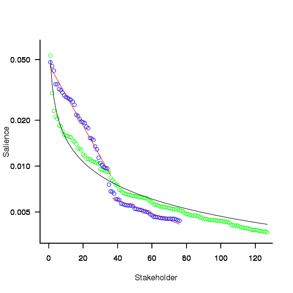
Figure 1. Plot of Pagerank of the stakeholder nodes in the network created from the Open (green) and Closed (blue) stakeholder responses (values for each have been sorted). See text for details of fitted curves.
To compare the ability of network centrality metrics to produce usable orderings of stakeholder roles a comparison has to be made against the Ground truth. The information in the Ground truth is a ranked list of stakeholder roles, not numeric values. The Stakeholder/centrality metric pairs need to be mapped to a ranked list of stakeholder roles. This mapping is achieved by associating a stakeholder role with each stakeholder name (this association was collected by Lim during the interview process), sorting stakeholder role/names by decreasing centrality metric and then ranking roles based on their first occurrence in the sorted list (see rexample[stakeholder]).
The Ground truth contains stakeholder roles not filled by any of the stakeholders in the Open or Closed data set, and vice versa. Before calculating role ranking correlation by roles not in both lists were removed.
The table below lists the Pearson correlation between the Ground truth ranking of stakeholder roles and for the ranking produced from calculating various network metrics from the Closed and Open stakeholder salience questionnaire data (when applied to ranks the Pearson correlation coefficient is equivalent to the Spearman rank correlation coefficient).
| betweenness | closeness | degree in | degree out | eigenvector | pagerank | |
|---|---|---|---|---|---|---|
|
Open
|
0.63
|
0.46
|
0.54
|
0.52
|
0.62
|
0.60
|
|
Weighted Open
|
0.66
|
0.49
|
0.62
|
0.50
|
0.68
|
0.67
|
|
Closed
|
0.51
|
0.53
|
0.67
|
0.60
|
0.69
|
0.71
|
|
Weighted Closed
|
0.50
|
0.50
|
0.63
|
0.54
|
0.68
|
0.72
|
The Open/Closed correlation calculation is based on a linear ranking. However, plotting Stakeholder salience, as in the plot above, shows a nonlinear distribution, with the some stakeholders having a lot more salience than less others. A correlation coefficient calculated by weighting the rankings may be more realistic. The “weighted” rows in the above are the correlations calculated using a weight based on the equations fitted in the Pagerank plot above; there is not a lot of difference.
Discussion
Network metrics are very new and applications making use of them still do so via a process of trial and error. For instance, the Pagerank algorithm was found to provide a good starting point for ranking web pages and many refinements have subsequently been added to the web ranking algorithms used by search engines.
When attempting to assign a priority to stakeholder roles and the people that fill them various network metric provide different ways of interpreting information about relationships between stakeholders. Lim’s work has shown that some network metrics can be used to produce ranks similar to those actually used (at least for one project).
One major factor not included in the above analysis is the financial contribution that each stakeholder role makes towards the implementation cost. Presumably those roles contributing a large percentage will want to be treated as having a higher priority than those contributing a smaller percentage.
The social network metrics calculated for stakeholder roles were only used to generate a ranking so that a comparison could be made against the ranked list available in the Ground truth. A rank ordering is a linear relationship between stakeholders; in real life differences in priority given to roles and stakeholders may not be linear. Perhaps the actual calculated network metric values are a better (often nonlinear) measure of relative difference, only experience will tell.
Summary of findings
Building a successful application is a very hard problem and being successful at it is something of a black art. There is nothing to say that a different Ground truth stakeholder role ranking would have lead to the RALIC project being just as successful. The relatively good correlation between the Ground truth ranking and the ranking created using some of the network metrics provides some confidence that these metrics might be of practical use.
Given that information on stakeholders’ rating of other stakeholders can be obtained relatively cheaply (Lim built a web site to collect this kind of information <book Lim_11>), for any large project a social network analysis appears to be a cost effect way of gathering and organizing information.
Halstead’s metrics and flat-Earthers are still with us
I recently discovered a fascinating series of technical reports from the 1970s in the Purdue University e-Pubs archive that shine a surprising light on what are now known as the Halstead metrics.
The first surprises came from Halstead’s A Software Physics Analysis of Akiyama’s Debugging Data; surprising in the size of the data set used (nine measurements of four attributes), the amount of hand waving used to pluck numbers out of thin air, the substantial difference between the counting methods used then and now and the very high correlation found between various measured and calculated attributes.
I disagreed with the numbers Halstead plucked and wrote some R to check Halstead’s results and try out my own numbers. While my numbers significantly changed the effort estimation values, the high correlations between the number of faults and various source attributes remained high. Even changing from the Pearson correlation coefficient (calculating confidence bounds for this coefficient requires that the data be normally distributed, which it is not {program size is now thought to follow a power law/exponential like distribution}) to the Spearman rank correlation coefficient did not have much impact. Halstead seems to have struck luck with this data set.
What did Halstead’s colleagues at Purdue think of these metrics? The report Software Science Revisited: A Critical Analysis of the Theory and Its Empirical Support written four years after Halstead’s flurry of papers contains a lot of background material and points out the lack of any theoretical foundation for some of the equations, that the analysis of the data was weak and that a more thorough analysis suggests theory and data don’t agree. Damming stuff.
If it is known that Halstead’s metrics do not hold up why do writers of books (including Shen, Conte and Dunsmore, the authors of the above report) continue to discuss Halstead’s work? Are they treating this work like Astronomy authors treat Ptolemy’s theory (the Sun and planets revolved around the Earth), i.e., incorrect but part of history and worth a mention?
An observation in the Shen et al report, that Halstead originally proposed the metrics as a way of measuring the complexity of algorithms not programs, explains the background to the report Impurities Found in Algorithm Implementations. Halstead uses the term “impurities” and talks about the need for “purification” in his early work. In this report Halstead points out that the value of metrics for “algorithms written by students” are very different from those for the equivalent programs published in journals and goes on to list eight classes of impurity that need to be purified (i.e., removing or rewriting clumsy, inefficient or duplicate code) in order to obtain results that agree with the theory. Now we know what needs to be done to existing programs to get them to agree with the predictions made by the Halstead metrics!
Did Halstead strike lucky with the data used in his first published analysis of ‘industrial code’, obtaining a very high correlation that caused him to shift focus away from measuring algorithms to measuring programs? Unfortunately, he died soon after publishing the work for which he is now known, so he did not get to comment on how his ideas were used over the subsequent years.
Why are people still attracted to the Halstead metrics, given their poor theoretical foundations and a predictive power that is comparable with using lines of code? Is it because the idea of code volume and length are easy to understand and so are attractive (dimensionally, both of these metrics are the same, a fact that cannot hold for any self-consistent concept of volume and length)? Is it because we don’t have alternative metrics that outperform the poorly performing ones proposed by Halstead, after all Copernicus only won out because his theory gave answers that were more accurate than Ptolomy’s.
Perhaps like the flat Earthers proponents of the Halstead metrics will always be with us.
Empirical software engineering is five years old
Science and engineering are built on theoretical models that are tested against measurements of ‘reality’. Until around 10 years ago there was very little software engineering ‘reality’ publicly available; companies rarely made source available and were generally unforthcoming about any bugs that had been discovered. What happened around 10 years ago was the creation of public software repositories such as SourceForge and public fault databases such as Bugzilla. At last researchers had access to what could be claimed to be real world data.
Over the last five years there has been an explosion of papers using SourceForge/Bugzilla kinds of data looking for a connection between everything+kitchen sink and faults. The traditional measures such as Halstead and McCabe have not stood up well against this onslaught of data, hardly surprising given they were more or less conjured out of thin air. Some researchers are trying to extract information about developer characteristics from mailing lists; given that software is written by developers there is obviously a real need for the characteristics of major project contributors to play a significant role in any theory of software faults.
Software engineering data includes a lot more than what can be extracted from source code, bug lists and email lists. A growing number of repositories have been set up to hold measurement and experimental data, e.g., hardware failures, effort prediction (while some of this data is pre-2000 it tends to be low volume or poor quality), and file system related.
At the individual level a small number of researchers have made data available on their own web site, a few more will send a copy if asked and sadly there are many cases where the raw data has been lost. In two recent cases researchers have responded to my request for raw data by telling me they are working on additional papers and don’t want to make the data public yet. I can understand that obtaining interesting data requires a lot of work and researchers want to extract maximum benefit; I look forward to see the new papers and the eventual availability of the data.
My interest in all this data is that I have started work on a book covering empirical software engineering using R. Five years ago such book would have contained lots of equations, plenty of hand waving and if data sets were available they would probably have been small enough to print on one page. Today there are still plenty of equations (mostly relating to statistical this that and the other), no hand waving (well, none planned), data sets for everything covered (some in the gigabytes and a few that can still fit on a page) and pretty pictures (color graphs, as least for the pdf version).
When historians trace back the history of empirical software engineering I think they will say that it started for real sometime around 2005. Before then, any theories that were based on observation tended to have small, single study, data sets with little statistical significance or power.
Recent Comments