Archive
Software effort estimation is mostly fake research
Effort estimation is an important component of any project, software or otherwise. While effort estimation is something that everybody in industry is involved with on a regular basis, it is a niche topic in software engineering research. The problem is researcher attitude (e.g., they are unwilling to venture into the wilds of industry), which has stopped them acquiring the estimation data needed to build realistic models. A few intrepid people have risked an assault on their ego and talked to people in industry, the outcome has been, until very recently, a small collection of tiny estimation datasets.
In a research context the term effort estimation is actually a hang over from the 1970s; effort correction more accurately describes the behavior of most models since the 1990s. In the 1970s models took various quantities (e.g., estimated lines of code) and calculated an effort estimate. Later models have included an estimate as input to the model, producing a corrected estimate as output. For the sake of appearances I will use existing terminology.
Which effort estimation datasets do researchers tend to use?
A 2012 review of datasets used for effort estimation using machine learning between 1991-2010, found that the top three were: Desharnias with 24 papers (29%), COCOMO with 19 papers (23%) and ISBSG with 17. A 2019 review of datasets used for effort estimation using machine learning between 1991 and 2017, found the top three to be NASA with 17 papers (23%), the COCOMO data and ISBSG were joint second with 16 papers (21%), and Desharnais was third with 14. The 2012 review included more sources in its search than the 2019 review, and subjectively your author has noticed a greater use of the NASA dataset over the last five years or so.
How large are these datasets that have attracted so many research papers?
The NASA dataset contains 93 rows (that is not a typo, there is no power-of-ten missing), COCOMO 63 rows, Desharnais 81 rows, and ISBSG is licensed by the International Software Benchmarking Standards Group (academics can apply for a limited time use for research purposes, i.e., not pay the $3,000 annual subscription). The China dataset contains 499 rows, and is sometimes used (there is no mention of a supercomputer being required for this amount of data ;-).
Why are researchers involved in software effort estimation feeding tiny datasets from the 1980s-1990s into machine learning algorithms?
Grant money. Research projects are more likely to be funded if they use a trendy technique, and for the last decade machine learning has been the trendiest technique in software engineering research. What data is available to learn from? Those estimation datasets that were flogged to death in the 1990s using non-machine learning techniques, e.g., regression.
Use of machine learning also has the advantage of not needing to know anything about the details of estimating software effort. Everything can be reduced to a discussion of the machine learning algorithms, with performance judged by a chosen error metric. Nobody actually looks at the predicted estimates to discover that the models are essentially producing the same answer, e.g., one learner predicts 43 months, 2 weeks, 4 days, 6 hours, 47 minutes and 11 seconds, while a ‘better’ fitting one predicts 43 months, 2 weeks, 2 days, 6 hours, 27 minutes and 51 seconds.
How many ways are there to do machine learning on datasets containing less than 100 rows?
A paper from 2012 evaluated the possibilities using 9-learners times 10 data-prerocessing options (e.g., log transform or discretization) times 7-error estimation metrics giving 630 possible final models; they picked the top 10 performers.
This 2012 study has not stopped researchers continuing to twiddle away on the option’s nobs available to them; anything to keep the paper mills running.
To quote the authors of one review paper: “Unfortunately, we found that very few papers (including most of our own) paid any attention at all to properties of the data set.”
Agile techniques are widely used these days, and datasets from the 1990s are not applicable. What datasets do researchers use to build Agile effort estimation models?
A 2020 review of Agile development effort estimation found 73 papers. The most popular data set, containing 21 rows, was used by nine papers. Three papers used simulated data! At least some authors were going out and finding data, even if it contains fewer rows than the NASA dataset.
As researchers in business schools have shown, large datasets can be obtained from industry; ISBSG actively solicits data from industry and now has data on 9,500+ projects (as far as I can tell a small amount for each project, but that is still a lot of projects).
Are there any estimates on Github? Some Open source projects use JIRA, which includes support for making estimates. Some story point estimates can be found on Github, but the actuals are missing.
A handful of researchers have obtained and released estimation datasets containing thousands of rows, e.g., the SiP dataset contains 10,100 rows and the CESAW dataset contains over 40,000 rows. These datasets are generally ignored, perhaps because when presented with lots of real data researchers have no idea what to do with it.
Plotting artifacts when the axis involves lines of code
While reading a report from the very late Rome period, the plot below caught my attention (the regression line was not in the original plot). The points follow a general trend, suggesting that when implementing a module, lines of code written per man-hour increases as the size of the module increases (in LOC). There are explanations for such behavior: perhaps module implementation time is mostly think-time that is independent of LOC, or perhaps larger modules contain more lines that can be quickly implemented (code+data).
Then I realised that the pattern of points was generated by a mathematical artifact. Can you spot the artifact?

The x-axis shows LOC, and the y-axis shows LOC/man-hour. Just plotting LOC against LOC would produce a row of points along a straight line, and if we treat dividing by man-hours as roughly equivalent to dividing by a random number (which might have some correlation with LOC), the result is points scattered around a line going up to the right.
If LOC-per-hour were constant, the points would form a horizontal line across the plot.
In the below left plot, from a different report (whose axis are function-points, and function-points implemented per month), the author has fitted a line, and it is close to horizontal (suggesting that the mean FP-per-month is constant).
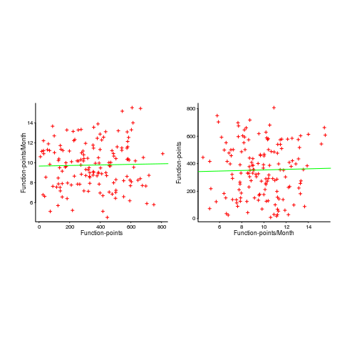
In fact the points are essentially random, and the line is a terrible fit (just how terrible is shown by switching the axis and refitting the line, above right; the refitted line should be vertical, but is horizontal. There is no connection between FP and FP-per-month, which is a good thing because the creators of function-points intended this to be true).
What process might generate this random scattering, rather than the trend seen in the first plot? If the implementation time was proportional to both the number of FP and some uniform random component, then the FP/time ratio would have the pattern seen.
The plots below show module size (in LOC) against man-hour (left) and FP against months (right):
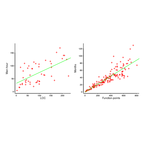
The module-LOC points are all over the place, while the FP points look as-if they are roughly consistent. Perhaps the module-LOC measurements came from a wide variety of sources, and we should not expect a visually pleasant trend.
Plotting LOC against LOC appears in other guises. Perhaps the most common being plotting fault-density against LOC; fault-density is generally calculated as faults/LOC.
Of course the artifacts also occur when plotting other kinds of measurements. Lines of code happens to be a commonly plotted quantity (at least in software engineering).
Wanted: 99 effort estimation datasets
Every now and again, I stumble upon a really interesting dataset. Previously, when this happened I wrote an extensive blog post; but the SiP dataset was just too big and too detailed, it called out for a more expansive treatment.
How big is the SiP effort estimation dataset? It contains 10,100 unique task estimates, from ten years of commercial development using Agile. That’s around two orders of magnitude larger than other, current, public effort datasets.
How detailed is the SiP effort estimation dataset? It contains the (anonymized) identity of the 22 developers making the estimates, for one of 20 project codes, dates, plus various associated items. Other effort estimation datasets usually just contain values for estimated effort and actual effort.
Data analysis is a conversation between the person doing the analysis and the person(s) with knowledge of the application domain from which the data came. The aim is to discover information that is of practical use to the people working in the application domain.
I suggested to Stephen Cullum (the person I got talking to at a workshop, a director of Software in Partnership Ltd, and supplier of data) that we write a paper having the form of a conversation about the data; he bravely agreed.
The result is now available: A conversation around the analysis of the SiP effort estimation dataset.
What next?
I’m looking forward to seeing what other people do with the SiP dataset. There are surely other patterns waiting to be discovered, and what about building a simulation model based on the charcteristics of this data?
Turning software engineering into an evidence-based disciple requires a lot more data; I plan to go looking for more large datasets.
Software engineering researchers are a remarkable unambitious bunch of people. The SiP dataset should be viewed as the first of 100 such datasets. With 100 datasets we can start to draw general, believable conclusions about the processes involved in software effort estimation.
Readers, today is the day you start asking managers to make any software engineering data they have publicly available. Yes, it can be anonymized (I am willing to do that for people who are looking to release data). Yes, ‘old’ data is useful (data from the 1980s could have an interesting story to tell; SiP runs from 2004-2014). Yes, I will analyze any interesting data that is made public for free.
Ask, and you shall receive.
Huge effort data-set for project phases
I am becoming a regular reader of software engineering articles written in Chinese and Japanese; or to be more exact, I am starting to regularly page through pdfs looking at figures and tables of numbers, every now and again cutting-and-pasting sequences of logograms into Google translate.
A few weeks ago I saw the figure below, and almost fell off my chair; it’s from a paper by Yong Wang and Jing Zhang. These plots are based on data that is roughly an order of magnitude larger than the combined total of all the public data currently available on effort break-down by project phase.
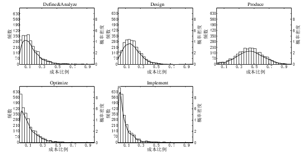
Projects are often broken down into phases, e.g., requirements, design, coding (listed as ‘produce’ above), testing (listed as ‘optimize’), deployment (listed as ‘implement’), and managers are interested in knowing what percentage of a project’s budget is typically spent on each phase.
Projects that are safety-critical tend to have high percentage spends in the requirements and testing phase, while in fast moving markets resources tend to be invested more heavily in coding and deployment.
Research papers on project effort usually use data from earlier papers. The small number of papers that provide their own data might list effort break-down for half-a-dozen projects, a few require readers to take their shoes and socks off to count, a small number go higher (one from the Rome period), but none get into three-digits. I have maybe a few hundred such project phase effort numbers.
I emailed the first author and around a week later had 2,570 project phase effort (man-hours) percentages (his co-author was on marriage leave, which sounded a lot more important than my data request); see plot below (code+data).
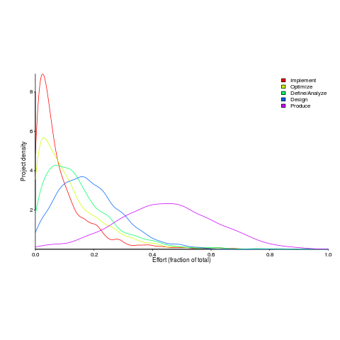
I have tried to fit some of the obvious candidate distributions to each phase, but none of the fits were consistently good across the phases (see code for details).
This project phase data is from small projects, i.e., one person over a few months to ten’ish people over more than a year (a guess based on the total effort seen in other plots in the paper).
A typical problem with samples in software engineering is their small size (apart from bugs data, lots of that is available, at least in uncleaned form). Having a sample of this size means that it should be possible to have a reasonable level of confidence in the results of statistical tests. Now we just need to figure out some interesting questions to ask.
Uncertainty in data causes inconsistent models to be fitted
Does software development benefit from economies of scale, or are there diseconomies of scale?
This question is often expressed using the equation:  . If
. If  is less than one there are economies of scale, greater than one there are diseconomies of scale. Why choose this formula? Plotting project effort against project size, using logs scales, produces a series of points that can be sort-of reasonably fitted by a straight line; such a line has the form specified by this equation.
Over the last 40 years, fitting a collection of points to the above equation has become something of a rite of passage for new researchers in software cost estimation; values for have ranged from 0.6 to 1.5 (not a good sign that things are going to stabilize on an agreed value).
This article is about the analysis of this kind of data, in particular a characteristic of the fitted regression models that has been baffling many researchers; why is it that the model fitted using the equation is not consistent with the model fitted using  , using the same data. Basic algebra requires that the equality
  be true, but in practice there can be large differences.
The data used is Data set B from the paper Software Effort Estimation by Analogy and Regression Toward the Mean (I cannot find a pdf online at the moment; Code+data). Another dataset is COCOMO 81, which I analysed earlier this year (it had this and other problems).
The difference between and  is a result of what most regression modeling algorithms are trying to do; they are trying to minimise an error metric that involves just one variable, the response variable.
In the plot below left a straight line regression has been fitted to some Effort/Size data, with all of the error assumed to exist in the  values (dotted red lines show the residual for each data point). The plot on the right is another straight line fit, but this time the error is assumed to be in the
  values (dotted green lines show the residual for each data point, with red line from the left plot drawn for reference). Effort is measured in hours and Size in function points, both scales show the
  of the actual value.
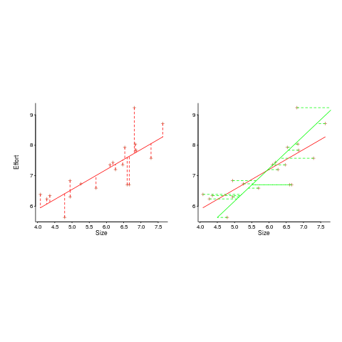
Regression works by assuming that there is NO uncertainty/error in the explanatory variable(s), it is ALL assumed to exist in the response variable. Depending on which variable fills which role, slightly different lines are fitted (or in this case noticeably different lines).
Does this technical stuff really make a difference? If the measurement points are close to the fitted line (like this case), the difference is small enough to ignore. But when measurements are more scattered, the difference may be too large to ignore. In the above case, one fitted model says there are economies of scale (i.e.,  ) and the other model says the opposite (i.e.,
  , diseconomies of scale).
There are several ways of resolving this inconsistency:
- conclude that the data contains too much noise to sensibly fit a a straight line model (I think that after removing a couple of influential observations, a quadratic equation might do a reasonable job; I know this goes against 40 years of existing practice of do what everybody else does…),
- obtain information about other important project characteristics and fit a more sophisticated model (characteristics of one kind or another are causing the variation seen in the measurements). At the moment information is being used to explain all of the variance in the data, which cannot be done in a consistent way,
- fit a model that supports uncertainty/error in all variables. For these measurements there is uncertainty/error in both and ; writing the same software using the same group of people is likely to have produced slightly different Effort/Size values.
There are regression modeling techniques that assume there is uncertainty/error in all variables. These are straight forward to use when all variables are measured using the same units (e.g., miles, kilogram, etc), but otherwise require the user to figure out and specify to the model building process how much uncertainty/error to attribute to each variable.
In my Empirical Software Engineering book I recommend using simex. This package has the advantage that regression models can be built using existing techniques and then ‘retrofitted’ with a given amount of standard deviation in specific explanatory variables. In the code+data for this problem I assumed 10% measurement uncertainty, a number picked out of thin air to sound plausible (its impact is to fit a line midway between the two extremes seen in the right plot above).
How to avoid being a victim of Brooks’ law
The oft cited book The Mythical Man Month contains a statement that has become known as Brooks’ Law: “Adding manpower to a late software project makes it later”.
When people join a project they need to learn project specific information, this is information that can only be obtained from people already working on the project. Training up new staff (e.g., developers, documentation writers) reduces the amount of effort being directly invested in building the system; it is an investment in people whose benefit is the post-training productivity of those people adding their effort to the project.
Let’s assume that a newbie diverts from the project they are joining an amount of effort units of time,  , in training without contributing anything, and that this training/investment lasts for
  units of time after which the trained person contributes an average of
  of effort per unit of time until the project deadline. This investment in a newbie will cause the project to be delayed unless the following inequality holds:
where  is the average daily project effort available before a newbie joins and
  is the number of units of time between the start of training and the delivery date/time.
This simplifies to:

an equation that makes the obvious point that as the deadline approaches the amount of time and effort spent training newbies needs to decrease if a worthwhile payback is to be achieved in the available time.
The quantity  is the amount of time remaining after the newbie finishes training (in practice this is rarely a well defined point in time, but let’s keep things simple) and is the only easily obtained information in the equation.
The effort contribution of the newbie, , could be approximated using information on the effort contribution of other people doing a similar job on the project. At least it could be if data was available on what their effort contribution was, and we overlooked the possible 5:1 difference in performance found between software developers. In practice a newbie’s effort contribution ramps up from zero, perhaps even starting during the training period, to a relatively constant long term daily average. How long does it take for to reach the long term average? I have no idea.
How much effort, , goes into training a newbie? A very important factor will obviously be their existing level of expertise with the application domain, tools being used, coding skills, etc (pretty much everything was new, back in the day, for the project analysed by Brooks, so was probably very high). There is also the somewhat nebulous but very important ability, or lack of, to pick things up quickly.
Could data on be obtained by recording every encounter the newbie has with existing project members? This would certainly enable information on first order time interactions to be obtained, but it would not tell us anything about the knock on effects caused by the work of an existing project member being delayed because they were investing in the newbie.
If many people are being added to a project at the same time it is easy to imagine it grinding to a halt because of all the minor congestion that occurs within the network of dependencies that project progress is waiting on.
I have not been able to locate any applicable data relating to training on software development projects, but then this area is at the edge of what I know about. Pointers to data most welcome.
Recent Comments