Archive
Data+code for book: The New C Standard
All the data+code from my book The New C Standard: An Economic and Cultural Commentary is now available on GitHub. For many years I have been meaning to create an easy way to map from a graph/table in the book to the file containing the data, which has blocked me adding the data to GitHub. I have unblocked by releasing this minimal viable product, i.e., it is essentially a copy of the usage subdirectory in the book’s directory.
While the five stage process to get from graph/table to data is tedious, at least there is a process that provides the data. The caption of the graphs in my Evidence-based Software Engineering book contain a link to the corresponding file on GitHub. This was not possible for the C book because GitHub was still 3-years in the future when the book was published (in 2005).
Work on the book started in late 1999 and measurements of C usage was an integral component. Publicly available source code was still a novelty and large Open source projects were rare (SourceForge was launched at the end of 1999). The large projects with C source available to measure were: Linux, Netscape, Gcc, PostgresSQL, OpenAFS, and OpenMotif. Several popular projects originally written in C had migrated to using C++, and were therefore not applicable.
As the book was completed in 2005, evidence-based software engineering restarted, 20-years after the fall of Rome. Or rather, I have nominated 2005 as the year this happened. Feel free to quibble plus/minus a few years.
Search engines were an essential tool for obtaining research papers, reports, and occasionally downloading data. In 2000 the search engine of choice was AltaVista, but a few years later Google had become the best.
While writing the book, I was a regular visitor to bricks and mortar buildings called libraries. Back then, university libraries contained tens of thousands of physical books, and researchers would photocopy papers of interest. Little did I know that this research practice would soon be dead.
In 2005, I had this to say about software evolution:
Measuring the characteristics of software that change over many releases (software evolution) is a relatively new research topic. Software evolution is discussed in a few sentences, and any future major revision ought to cover this important topic in substantially more detail. |
How might C source code characteristics have changed in the last 20 years?
- The use of K&R style function definitions is probably very rare; it was well on the way out in 1999,
- big software systems have gotten bigger, i.e., more lines of code and more
#includes, - A lot more code using 32-bit integers and 64-bit pointers,
- More storage allocated (memory capacity has increased) because it’s faster to do everything in memory, and there is more data.
Good enough reliability models: still an unknown
Estimating the likelihood that a software system will operate as intended, for some period of time, is one of the big problems within the field of software reliability research. When software does not operate as intended, a fault, or bug, or hallucination is said to have occurred.
Three events need to occur for a user of a software system to experience a fault:
- a developer writes code that does not always behave as intended, i.e., a coding mistake,
- the user of the software feeds it input that causes the coding mistake to produce unintended behavior,
- the unintended behavior percolates through the system to produce a visible fault (sometimes an unintended behavior does not percolate very far, and does not produce any change of visible behavior).
Modelling each kind of event and their interaction is a huge undertaking. Researchers in one of the major subfields of software reliability take a global approach, e.g., they model time to next fault experience, using data on the number of faults experienced per given amount of cpu/elapsed time (often obtained during testing). Modelling the fault data obtained during testing results in a model of the likelihood of the next fault experienced using that particular test process. This is useful for doing a return-on-investment calculation to decide whether to do more testing. If the distribution of inputs used during testing is similar to the distribution of customer inputs, then the model can be of use in estimating the rate of customer fault experiences.
Is it possible to use a model whose design was driven by data from testing one or more software systems to estimate the rate of fault experiences likely when testing other software systems?
The number of coding mistakes will differ between systems (because they have different sizes, and/or different developer abilities), and the testers’ ability will be different, and the extent to which mistaken behavior percolates through code will differ. However, it is possible for there to be a general model for rate of fault experiences that contains various parameters that need to be fitted for each situation.
Since that start of the 1970s, researchers have been searching for this general model (the first software reliability model is thought to be: “Program errors as a birth-and-death process” by G. R. Hudson, Report SP-3011, System Development Corp., 1967 Dec 4; please send me a copy, if you have one).
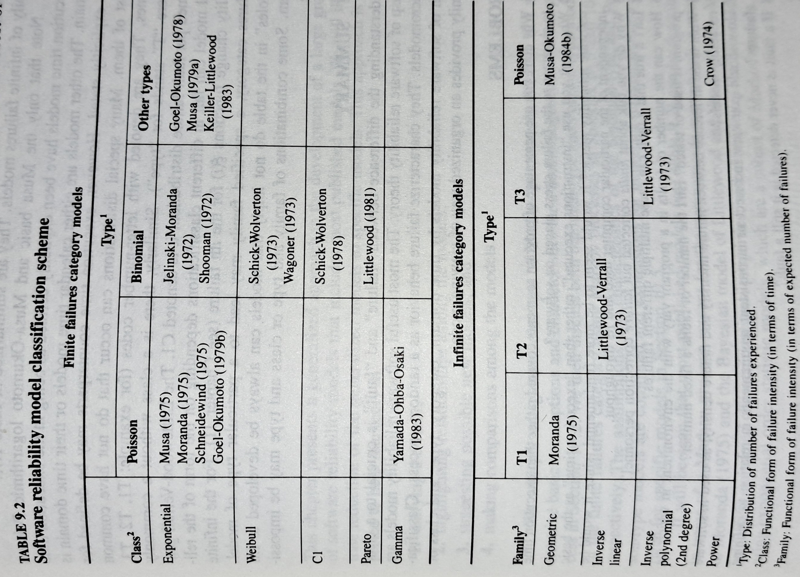
The image below shows the 18 models discussed in the 1987 book “Software Reliability: Measurement, Prediction, Application” by Musa, Iannino, and Okumoto (later editions have seriously watered down the technical contents, and lack most of the tables/plots). It’s to be expected that during the early years of a new field, many different models will be proposed and discussed.
Did researchers discover a good-enough general model for rate of fault experiences?
It’s hard to say. There is not enough reliability data to be confident that any of the umpteen proposed models is consistently better at predicting than any other. I believe that the evidence-based state of the art has not yet progressed beyond the 1982 report Software Reliability: Repetitive Run Experimentation and Modeling by Nagel and Skrivan.
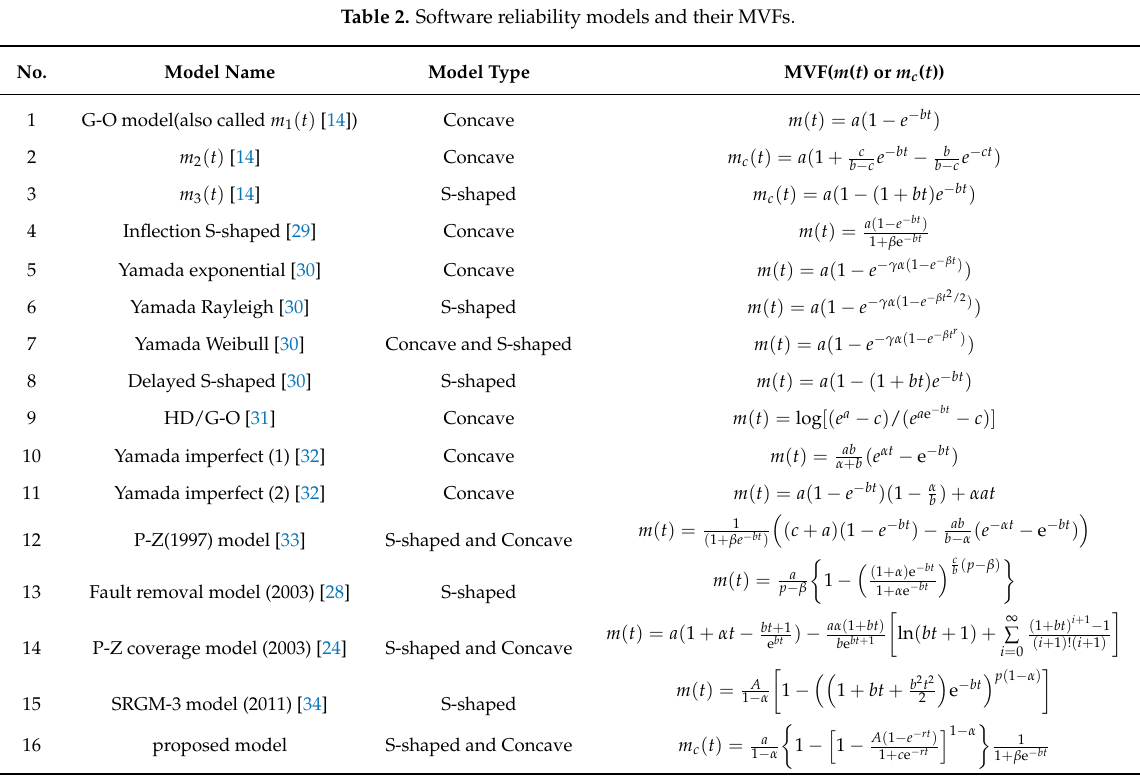
Fitting slightly modified versions of existing models to a small number of tiny datasets has become standard practice in this corner of software engineering research (the same pattern of behavior has occurred in software effort estimation). The image below shows 16 models from a 2021 paper.
Nearly all the reliability data used to create these models is from systems built in the 1960s and 1970s. During these decades, software systems were paid for organizations that appreciated the benefits of collecting data to build models, and funding the necessary research. My experience is that few academics make an effort to talk to people in industry, which means they are unlikely to acquire new datasets. But then researchers are judged by papers published, and the ecosystem they work within is willing to publish papers extolling the virtues of another variant of an existing model.
The various software fault datasets used to create reliability models tends to be scattered in sometimes hard to find papers (yes, it is small enough to be printed in papers). I have finally gotten around to organizing all the public data that I have in one place, a Reliability data repo on GitHub.
If you have a public fault dataset that does not appear in this repo, please send me a copy.
Frequency of non-linear relationships in software engineering data
Causality is an integral part of the developer mindset, and correlation is a common hammer that developers use for the analysis of data (usually the Pearson correlation coefficient).
The problem with using Pearson correlation to analyse software engineering data is that it calculates a measure of linear relationships, and software data is often non-linear. Using a more powerful technique would not only enable any non-linearity to be handled, it would also extract more information, e.g., regression analysis.
My impression is that power laws and exponential relationships abound in software engineering data, but exactly how common are they (and let’s not forget polynomial relationships, e.g., quadratics)?
I claim that my Evidence-based Software Engineering analyses all the publicly available software engineering data. How often do non-linear relationships occur in this data?
The data is invariably plotted, and often a regression model is fitted. A search of the data analysis code (written in R) located 996 calls to plot and 446 calls to glm (used to fit a regression model; shell script).
In calls to plot, the log argument can be used to specify that a log-scale be used for a given axis. When the data has an exponential distribution, I specified the appropriate axis to be log-scaled (18% of cases); for a power law, both axis were log-scaled (11% of cases).
In calls to glm, one or more of the formula variables may be log transformed within the formula. When the data has an exponential distribution, either the left-hand side of the formula is log transformed (20% of cases), or one of the variables on the right-hand side (9% of cases, giving 29% in total); for a power law both sides of the formula are log transformed (12% of cases).
Within a glm formula, variables can be raised to a power by enclosing the expression in the I function (the ^ operator has a special meaning within a formula, but its usual meaning inside I). The most common operation appearing inside I is ^2, i.e., squaring a value. In the following table, only formula that did not log transform any variable were searched for calls to I.
The analysis code contained 54 calls to the nls function, whose purpose is to fit non-linear regression models.
    plot   log="x"  log="y"       log="xy"
    996      4%       14%            11%

    glm    log(x)   log(y)    log(y) ~ log(x)   I()
446 9% 20% 12% 12% |
Based on these figures (shell script), at least 50% of software engineering data contains non-linear relationships; the values in this table are a lower bound, because variables may have been transformed outside the call to plot or glm.
The at least 50% estimate is based on all software engineering, some corners will have higher/lower likelihood of encountering non-linear data; for instance, estimation data often contains power law relationships.
What software engineering data have I collected on subject X?
While it’s great that so much data was uncovered during the writing of the Evidence-based software engineering book, trying to locate data on a particular topic can be convoluted (not least because there might not be any). There are three sources of information about the data:
- the paper(s) written by the researchers who collected the data,
- my analysis and/or discussion of the data (which is frequently different from the original researchers),
- the column names in the csv file, i.e., data is often available which neither the researchers nor I discuss.
At the beginning I expected there to be at most a few hundred datasets; easy enough to remember what they are about. While searching for some data, one day, I realised that relying on memory was not a good idea (it was never a good idea), and started including data identification tags in every R file (of which there are currently 980+). This week has been spent improving tag consistency and generally tidying them up.
How might data identification information be extracted from the paper that was the original source of the data (other than reading the paper)?
Named-entity recognition, NER, is a possible starting point; after all, the data has names associated with it.
Tools are available for extracting text from pdf file, and 10-lines of Python later we have a list of named entities:
import spacy # Load English tokenizer, tagger, parser, NER and word vectors nlp = spacy.load("en_core_web_sm") file_name = 'eseur.txt' soft_eng_text = open(file_name).read() soft_eng_doc = nlp(soft_eng_text) for ent in soft_eng_doc.ents: print(ent.text, ent.start_char, ent.end_char, ent.label_, spacy.explain(ent.label_)) |
The catch is that en_core_web_sm is a general model for English, and is not software engineering specific, i.e., the returned named entities are not that good (from a software perspective).
An application domain language model is likely to perform much better than a general English model. While there are some application domain models available for spaCy (e.g., biochemistry), and application datasets, I could not find any spaCy models for software engineering (I did find an interesting word2vec model trained on Stackoverflow posts, which would be great for comparing documents, but not what I was after).
While it’s easy to train a spaCy NER model, the time-consuming bit is collecting and cleaning the text needed. I have plenty of other things to keep me busy. But this would be a great project for somebody wanting to learn spaCy and natural language processing 🙂
What information is contained in the undiscussed data columns? Or, from the practical point of view, what information can be extracted from these columns without too much effort?
The number of columns in a csv file is an indicator of the number of different kinds of information that might be present. If a csv is used in the analysis of X, and it contains lots of columns (say more than half-a-dozen), then it might be assumed that it contains more data relating to X.
Column names are not always suggestive of the information they contain, but might be of some use.
Many of the csv files contain just a few rows/columns. A list of csv files that contain lots of data would narrow down the search, at least for those looking for lots of data.
Another possibility is to group csv files by potential use of data, e.g., estimating, benchmarking, testing, etc.
More data is going to become available, and grouping by potential use has the advantage that it is easier to track the availability of new data that may supersede older data (that may contain few entries or apply to circumstances that no longer exist)
My current techniques for locating data on a given subject is either remembering the shape of a particular plot (and trying to find it), or using the pdf reader’s search function to locate likely words and phrases (and then look at the plots and citations).
Suggestions for searching or labelling the data, that don’t require lots of effort, welcome.
Publishing information on project progress: will it impact delivery?
Numbers for delivery date and cost estimates, for a software project, depend on who you ask (the same is probably true for other kinds of projects). The people actually doing the work are likely to have the most accurate information, but their estimates can still be wildly optimistic. The managers of the people doing the work have to plan (i.e., make worst/best case estimates) and deal with people outside the team (i.e., sell the project to those paying for it); planning requires knowledge of where things are and where they need to be, while selling requires being flexible with numbers.
A few weeks ago I was at a hackathon organized by the people behind the Project Data and Analytics meetup. The organizers (Martin Paver & co.) had obtained some very interesting project related data sets. I worked on the Australian ICT dashboard data.
The Australian ICT dashboard data was courtesy of the Queensland state government, which has a publicly available dashboard listing digital project expenditure; the Victorian state government also has a dashboard listing ICT expenditure. James Smith has been collecting this data on a monthly basis.
What information might meaningfully be extracted from monthly estimates of project delivery dates and costs?
If you were running one of these projects, and had to provide monthly figures, what strategy would you use to select the numbers? Obviously keep quiet about internal changes for as long as possible (today’s reduction can be used to offset a later increase, or vice versa). If the client requests changes which impact date/cost, then obviously update the numbers immediately; the answer to the question about why the numbers changed is that, “we are responding to client requests” (i.e., we would otherwise still be on track to meet the original end-points).
What is the intended purpose of publishing this information? Is it simply a case of the public getting fed up with overruns, with publishing monthly numbers is seen as a solution?
What impact could monthly publication have? Will clients think twice before requesting an enhancement, fearing public push back? Will companies doing the work make more reliable estimates, or work harder?
Project delivery dates/costs change because new functionality/work-to-do is discovered, because the appropriate staff could not be hired and other assorted unknown knowns and unknowns.
Who is looking at this data (apart from half a dozen people at a hackathon on the other side of the world)?
Data on specific projects can only be interpreted in the context of that project. There is some interesting research to be done on the impact of public availability on client and vendor reporting behavior.
Will publication have an impact on performance? One way to get some idea is to run an A/B experiment. Some projects have their data made public, others don’t. Wait a few years, and compare project performance for the two publication regimes.
Statistical techniques not needed to analyze software engineering data
One of the methods I used to try to work out what statistical techniques were likely to be useful to software developers, was to try to apply techniques that were useful in other areas. Of course, applying techniques requires the appropriate data to apply them to.
Extreme value statistics are used to spot patterns in rare events, e.g., frequency of rivers over spilling their banks and causing extensive flooding. I have tried and failed to find any data where Extreme value theory might be applicable. There probably is some such data, somewhere.
The fact that I have spent a lot of time looking for data and failed to find particular kinds of data, suggests that occurrences are rare. If data needing a particular kind of analysis technique is rare, there is no point including a discussion of the technique in a book aimed at providing general coverage of material.
I have spent some time looking for data drawn from a zero-inflated Poisson distribution. Readers are unlikely to have ever heard of this and might well ask why I would be interested in such an obscure distribution. Well, zero-truncated Poisson distributions crop up regularly (the Poisson distribution applies to count data that starts at zero, when count data starts at one the zeroes are said to be truncated and the Poisson distribution has to be offset to adjust for this). There is a certain symmetry to zero-truncated/inflated (although the mathematics involved is completely different), plus there is probably a sunk cost effect (i.e., I have spent time learning about them, I am going to find the data).
I spotted a plot in a paper investigating record data structure usage in Racket, that looked like it might be well fitted by a zero-inflated Poisson distribution. Tobias Pape kindly sent me the data (number of record data structures having a given size), which I then failed miserably to fit to any kind of Poisson related distribution; see plot below; data points along red line through the plus symbols (code+data):
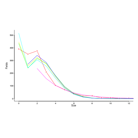
I can only imagine what the authors thought of my reason for wanting the data (I made data requests to a few other researchers for similar reasons; and again I failed to fit the desired distribution).
I had expected to make more use of time series analysis; but, it has just not been that applicable.
Machine learning is useful for publishing papers, but understanding what is going on is the subject of my book, not building black boxes to make predictions.
It is possible that researchers are not publishing work relating to data that requires statistical techniques I have not used, because they don’t know how to analyze the data or the data is too hard to collect. Inability to use the correct techniques to analyze data is rarely a reason for not publishing a paper. Data being too hard to collect is very believable, as-is the data rarely occurring in software engineering related work.
There are statistical tests I have intentionally ignored, the Mann–Whitney U test (aka, the Wilcoxon rank-sum test) and the t-test probably being the most well-known. These tests became obsolete once computers became generally available. If you are ever stuck on a desert island without a computer, these are the statistical tests you will have to use.
Major players in evidence-based software engineering
Who are the major players in evidence-based software engineering?
How might ‘majorness’ of players be calculated? For me, the amount of interesting software engineering data they have made publicly available is the crucial factor. Any data published in a book, paper or report is enough to be considered interesting. How interesting is data published on a web page? This is a tough question, let’s dodge the question to start with, and consider the decades before the start of 2000.
In the academic world performance is based on number of papers published, the impact factor of where they were published and number of citations of those papers. This skews the results in favor of those with lots of students (who tack their advisor’s name on the end of papers published) and those who are good at marketing.
Historians of computing have primarily focused on the evolution of hardware and are slowly moving to discuss software (perhaps because microcomputers have wiped out nearly every hardware vendor). So we will have to wait perhaps a decade or two for tentative/definitive historian answer.
The 1950s
Computers and Automation is a criminally underused resource (a couple of PhDs worth of primary data here). A lot of the data is hardware related, but software gets a lot more than a passing mention.
The US military published lots of hardware data, but software does not get mentioned much.
The 1960s
Computers and Automation are still publishing.
The US military still publishing data; again mostly hardware related.
Datamation, a weekly news magazine, published a lot of substantial material on the software and hardware ecosystems as they evolved.
Kenneth Knight’s analysis of computer performance is an example of the kind of data analysis that many people undertook for hardware, which was rarely done for software.
The 1970s
The US military are still leading the way; we are in the time of Rome. Air Force officers studying for a Master’s degree publish more software engineering data than all academics combined over this and the next two decades.
“Data processing technology and economics” by Montgomery Phister is 720 A4 pages packed with graphs and tables of numbers. Despite citing earlier sources, this has become the primary source for a lot of subsequent researchers; this is understandable in a pre-internet age. Now we have Bitsavers and the Internet Archive, and the cited primary source can be downloaded.
NASA is surprisingly low volume.
The 1980s
Rome falls (i.e., the work gets outsourced to a university) and the false prophets (i.e., academics doing non-evidence based work) multiply and prosper. There are hushed references to trouble makers performing unclean acts experiments in the wilderness.
A few people working in the wilderness, meaning that the quantity of data being produced drops by at least an order of magnitude.
The 1990s
Enough time has passed for people to be able to refer to the wisdom of the ancients.
There are still people in the wilderness howling at the moon, and performing unclean acts experiments.
The 2000s
Repositories of Open source and bug reports grow and prosper. Evidence-based software engineering research starts to become mainstream.
There are now groups of people doing software engineering research.
What about individuals as major players? A vaguely scientific way of rating individual impact, on evidence-based software engineering, is to count the number of papers researchers have published, that are cited by a book claiming to discuss all the important/interesting publicly available software engineering data (code+data).
The 1,521 2,035 papers cited, by this book, had 3,716 5,095 authors, of which 3,095 4,210 were different. The authors who appeared most often are listed below (count on the right, and yes, at number 3 2 is a theoretician; I have cited myself nine 17 times, but two of those are to websites hosting data; Updated numbers to published version).
Magne Jorgensen 20 17
Massimiliano Di Penta 13 10
Anne Chao 10 11
Dag I. K. Sjoberg 10
Joseph Henrich 10
Ahmed E. Hassan 9 8
Christian Kästner 9
Sven Apel 9
Tom Mens 9
Audris Mockus 8
Christian Bird 8
Stanislas Dehaene 8
Andreas Zeller 7
Dror G. Feitelson 7 6
Gabriele Bavota 7
Giuliano Antoniol 7
Krzysztof Czarnecki 7 6
Rocco Oliveto 7
Thomas Zimmermann 7
Benoit Baudry 6
Bram Adams 6
Daniel M. German 6
Gerd Gigerenzer 6
Gregorio Robles 6
Lutz Prechelt 6
Victor R. Basili 6
Martin Monperrus 6
Alexander Serebrenik 5 6
The number of authors/papers follows the usual pattern of many people writing one paper.

Who might I have missed? The business school researchers don’t get a mention because their data is often covered by a confidentiality agreement. The machine learning crowd are just embarrassing.
Suggestions for major players welcome.
Business school research in software engineering is some of the best
There is a group of software engineering researchers that don’t feature as often as I would like in my evidence-based software engineering book; academics working in business schools.
Business school academics have written some of the best papers I have read on software engineering; the catch is that the data they use is confidential. For somebody writing a book that only discusses a topic if there is data publicly available, this is a problem.
These business school researchers show that it is possible for academics to obtain ‘interesting’ software engineering data from industry. My experience with talking to researchers in computing departments is that most are too involved in their own algorithmic bubble to want to talk to anybody else.
One big difference between the data analysis papers written by academics in computing departments and business schools, is statistical sophistication. Computing papers are still using stone-age pre-computer age techniques, the business papers use a wide range of sophisticated techniques (sometimes cutting edge).
There is one aspect of software engineering papers written by business school researchers that grates with me, many of the authors obviously don’t understand software engineering from a developer’s perspective; well, obviously, they are business oriented people.
The person who has done the largest amount of interesting software engineering research, whose work I don’t (yet; I will find a way) discuss, is Chris Kemerer; a researcher who has a long list of empirical papers going back to the late 1980s, and rarely gets cited by papers by people in computing departments (I am the only person I know, who limits themself to papers where the data is publicly available).
Data-set update to “Empirical software engineering using R”
The pile of papers, books and data-sets, relating to previously released draft chapters of my Empirical software engineering book, has been growing, and cluttering up my mind. I decided to have a clear-out.
A couple of things stood out.
There are around 25 data-sets that have been promised but not yet arrived. If you encounter anybody who mentions they promised to send me data, please encourage them to spend some time doing this. I don’t want to add a new category, promised but never delivered, to the list of email responses.
There has been an increase in data-sets not being used because I already have something better. This is a good sign, data quality is increasing. One consequence is that a growing number of ‘historical’ data-sets have fallen by the wayside. This is a good thing, most data-sets analysed in papers are very low quality and only used because nothing else was available.
One of my reasons for making draft releases was to prompt people to suggest data I had missed. This has not happened yet; come on people, suggest some data I don’t yet know about.
About a third of the pile got included in the latest draft, a third had been superseded by something better, and a third are still waiting for promised data.
Now, back to the reliability chapter.
Huge effort data-set for project phases
I am becoming a regular reader of software engineering articles written in Chinese and Japanese; or to be more exact, I am starting to regularly page through pdfs looking at figures and tables of numbers, every now and again cutting-and-pasting sequences of logograms into Google translate.
A few weeks ago I saw the figure below, and almost fell off my chair; it’s from a paper by Yong Wang and Jing Zhang. These plots are based on data that is roughly an order of magnitude larger than the combined total of all the public data currently available on effort break-down by project phase.
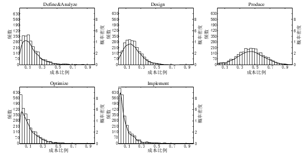
Projects are often broken down into phases, e.g., requirements, design, coding (listed as ‘produce’ above), testing (listed as ‘optimize’), deployment (listed as ‘implement’), and managers are interested in knowing what percentage of a project’s budget is typically spent on each phase.
Projects that are safety-critical tend to have high percentage spends in the requirements and testing phase, while in fast moving markets resources tend to be invested more heavily in coding and deployment.
Research papers on project effort usually use data from earlier papers. The small number of papers that provide their own data might list effort break-down for half-a-dozen projects, a few require readers to take their shoes and socks off to count, a small number go higher (one from the Rome period), but none get into three-digits. I have maybe a few hundred such project phase effort numbers.
I emailed the first author and around a week later had 2,570 project phase effort (man-hours) percentages (his co-author was on marriage leave, which sounded a lot more important than my data request); see plot below (code+data).
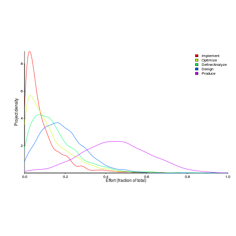
I have tried to fit some of the obvious candidate distributions to each phase, but none of the fits were consistently good across the phases (see code for details).
This project phase data is from small projects, i.e., one person over a few months to ten’ish people over more than a year (a guess based on the total effort seen in other plots in the paper).
A typical problem with samples in software engineering is their small size (apart from bugs data, lots of that is available, at least in uncleaned form). Having a sample of this size means that it should be possible to have a reasonable level of confidence in the results of statistical tests. Now we just need to figure out some interesting questions to ask.
Recent Comments