Archive
Extracting numbers from a stacked density plot
A month or so ago, I found a graph showing a percentage of PCs having a given range of memory installed, between March 2000 and April 2020, on a TechTalk page of PC Matic; it had the form of a stacked density plot. This kind of installed memory data is rare, how could I get the underlying values (a previous post covers extracting data from a heatmap)?
The plot below is the image on PC Matic’s site:
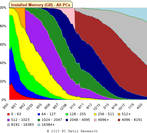
The change of colors creates a distinct boundary between different memory capacity ranges, and it ought to be possible to find the y-axis location of each color change, for a given x-axis location (with location measured in pixels).
The image was a png file, I loaded R’s png package, and a call to readPNG created the required 2-D array of pixel information.
library("png")
img=readPNG("../rc_mem_memrange_all.png") |
Next, the horizontal and vertical pixel boundaries of the colored data needed to be found. The rectangle of data is surrounded by white pixels. The number of white pixels (actually all ones corresponding to the RGB values) along each horizontal and vertical line dramatically drops at the data image boundary. The following code counts the number of col points in each horizontal line (used to find the y-axis bounds):
horizontal_line=function(a_img, col)
{
lines_col=sapply(1:n_lines, function(X) sum((a_img[X, , 1]==col[1]) &
                                            (a_img[X, , 2]==col[2]) &
                                            (a_img[X, , 3]==col[3]))
                )

return(lines_col)
}

white=c(1, 1, 1)
n_cols=dim(img)[2]

# Find where fraction of white points on a line changes dramatically
white_horiz=horizontal_line(img, white)

# handle when upper boundary is missing
ylim=c(0, which(abs(diff(white_horiz/n_cols)) > 0.5))
ylim=ylim[2:3] |
Next, for each vertical column of pixels, at each x-axis pixel location, the sought after y value occurs at the change of color boundary in the corresponding vertical column. This boundary includes a 1-pixel wide separation color, which creates a run of 2 or 3 consecutive pixel color changes.
The color change is easily found using the duplicated function.
# Return y position of vertical color changes at x_pos
y_col_change=function(x_pos)
{
# Good enough technique to generate a unique value per RGB color
col_change=which(!duplicated(img[y_range, x_pos, 1]+
                          10*img[y_range, x_pos, 2]+
                         100*img[y_range, x_pos, 3]))

# Handle a 1-pixel separation line between colors.
# Diff is used to find these consecutive sequences.
y_change=c(1, col_change[which(diff(col_change) > 1)+1])

# Always return a vector containing max_vals elements.
return(c(y_change, rep(NA, max_vals-length(y_change))))
} |
Next, we need to group together the sequence of points that delimit a particular boundary. The points along the same boundary are all associated with the same two colors, i.e., the ones below/above the boundary (plus a possible boundary color).
The plot below shows all the detected boundary points, in black, overwritten by colors denoting the points associated with the same below/above colors (code):
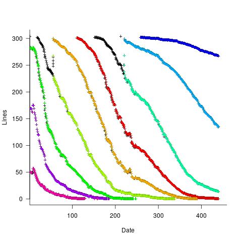
The visible black pluses show that the algorithm is not perfect. The few points here and there can be ignored, but the two blocks at the top of the original image have thrown a spanner in the works for some range of points (this could be fixed manually, or perhaps it is possible to tweak the color extraction formula to work around them).
How well does this approach work with other stacked density plots? No idea, but I am on the lookout for other interesting examples.
Extracting absolute values from percentage data
Empirical data on requirements for commercial software systems is extremely hard to find. Massimo Felici’s PhD thesis on requirements evolution contains some very interesting data relating to an avionics system, but in many cases the graphs are plotted without numbers next to the axis tick marks. I imagine these numbers were removed because of concerns about what people who had been promoted beyond their level of competence might say (I would also have removed them if asked by the company who had provided the raw data, its a data providers market).
As soon as I saw the plot below I knew I could reverse engineer the original numbers for the plot in the top left.
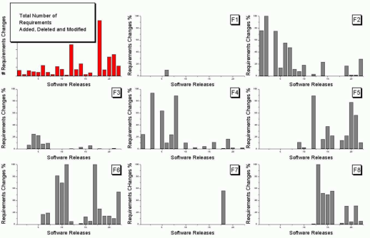
The top left plot is a total count of requirements added/deleted/modified in each of the 22 releases of the product. The eight other plots contain individual percentage information for each of the eight requirements features included in the total count product.
The key is that requirement counts have integer values and the percentages in the F1-8 plots are ratios that restrict the requirement counts to being exactly divisible by a calculated value.
I used WebPlotDigitizer, the goto tool for visually extracting data from plots, to obtain values for the height of each bar (for the time being assuming the unnumbered tick marks linearly increased in units of one).
Looking at the percentages for release one we see that 75% involved requirement feature F2 and 25% F4. This means that the total added/deleted/modified requirement count for release one must be divisible by 4. The percentages for release five are 64, 14 and 22; within a reasonable level of fuzziness this ratio is 9/2/3 and so the total count is probably divisible by 15. Repeating the process for release ten we get the ratio 7/4/1/28, probably divisible by 40; release six is probably divisible by 20, release nine by 10, release fourteen by 50 and fifteen by 10.
How do the release values extracted from the top left shape up when these divisibility requirements are enforced? A minimum value for the tick mark increment of 100 matches the divisibility requirements very well. Of course an increment of any multiple of 100 would match equally well, but until I spot a relationship that requires a larger value I will stick with 100.
I was not expecting to be so lucky in being able to extract useful ratios and briefly tried to be overly clever. Diophantine equations is the study of polynomial equations having integer solutions and there are lots of tools available for solving these equations. The data I have is fuzzy because it was extracted visually. A search for fuzzy diophantine equations locates some papers on how to solve such equations, but no obvious tools (there is code for solving fuzzy linear systems, but this technique does not restrict the solution space to integers).
The nearest possible solution path I could find involving statistics was: Statistical Analysis of Fuzzy Data.
If a reader has any suggestions for how to solve this problem automatically, given the percentage values, please let me know. Images+csvs for your delectation.
Recent Comments