AEC hackathon: what do the coloured squiggles mean?
I was at the AEC hackathon last weekend. There were a whole host of sponsors, but there was talk of project sponsorship for teams trying to solve a problem involving London’s Crossrail project. So most of those present were tightly huddled around tables, intently whispering to each other about their crossrail hack (plenty of slide-ware during the presentations).
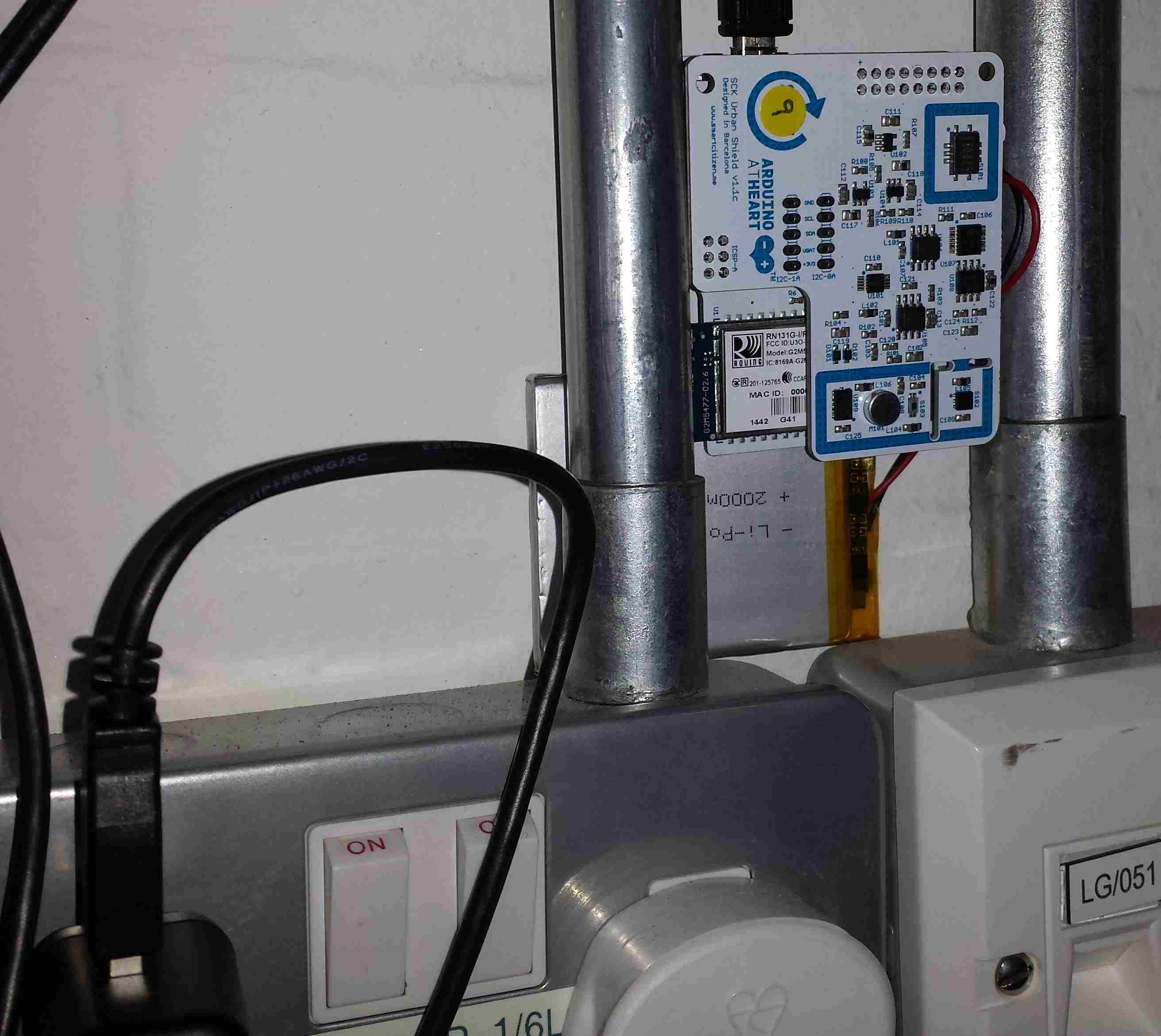
I arrived at hacker time (a bit later than all the keen folk who had been waiting outside for the doors to open from eight’ish) and missed out on forming a team. Talking to Nik and Geoff, from the Future Cities Catapult (one of the sponsors), I learned about the 15 sensor packages that had been distributed around the building we were in (Intel Photon+Smartcitizen sensor kits, connected via the local wifi).
These sensors had been registered with the Smart Citizen platform and various environmental measurements, around each sensor, was being recorded at 1 minute resolution. The sensors had been set up a few days earlier, so only recent data was available.
The Smart Citizen dashboard provided last recorded values and a historical plot for each sensor on its own (example here). The Future Cities guys wanted something a bit more powerful, and team Coloured Squiggles set to work (one full time member, plus anyone who dawdled within conversation range).
It did not take long, using R, to extract and plot the data from various sensors (code). The plot below shows just over a days worth of data from the sensor installed in the basement (where the hackathon took place). The red line is ambient light (which is all internal because we are underground), yellowish is sound level (the low level activity before the lights come on is air-conditioning switching on ready for Friday morning, there is no such activity for Saturday morning), blue is carbon monoxide (more about that later), green is nitrogen dioxide and purple is humidity. Values have been normalised.
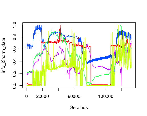
The interesting part of the project was interpreting the squiggly lines; what was making them go up and down. Nik was a great source of ideas and being involved with setting the sensors up knew about the kind of environment they were in, e.g., basement, by the window (a source of light) and on top of the coffee machine (which was on a fridge, whose cooling motor on/off cycling we eventually decided was causing the periodic nighttime spikes in the sound level seen in yellow below {ignore the x-axis values}).
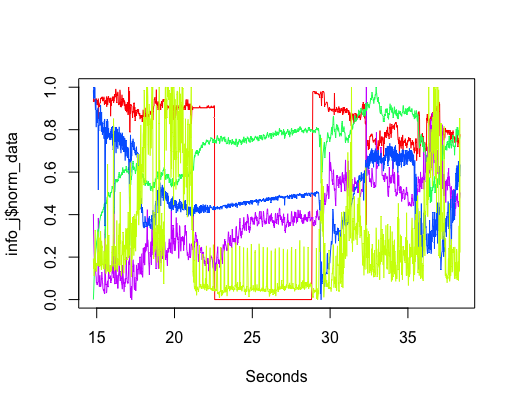
The variation in the level of Carbon-Monoxide was discussed a lot. IoT sensors are very low cost and so it is easy to question the quality of their output. However, all sensors showed this same pattern of behavior, although some contained more noise than others (compare the thickness of the blue lines in the above plots). One idea was that CO is heavier than air and sinks to the floor at night and gets stirred up in the morning, but Wikipedia says it is not heavier than air. Another idea was that the air-conditioning allows fresh outside into the building in the morning, which gets gradually gets filtered.
The lessons learned was that a sensor’s immediate environment can cause all sorts of unexpected variation in its output. The only way to figure out what is going on is by walking round talking to the people who occupy the same space as the sensor.
The final version provided a browser based interface, allowing individual devices and multiple sensor output to be selected (everything is on github).
Recent Comments